SOJO
Brand Identity + Type Design + UX
Fall 2024
Josué Avalos Jiménez
Alex Jackan
Kevin Foster
Overview
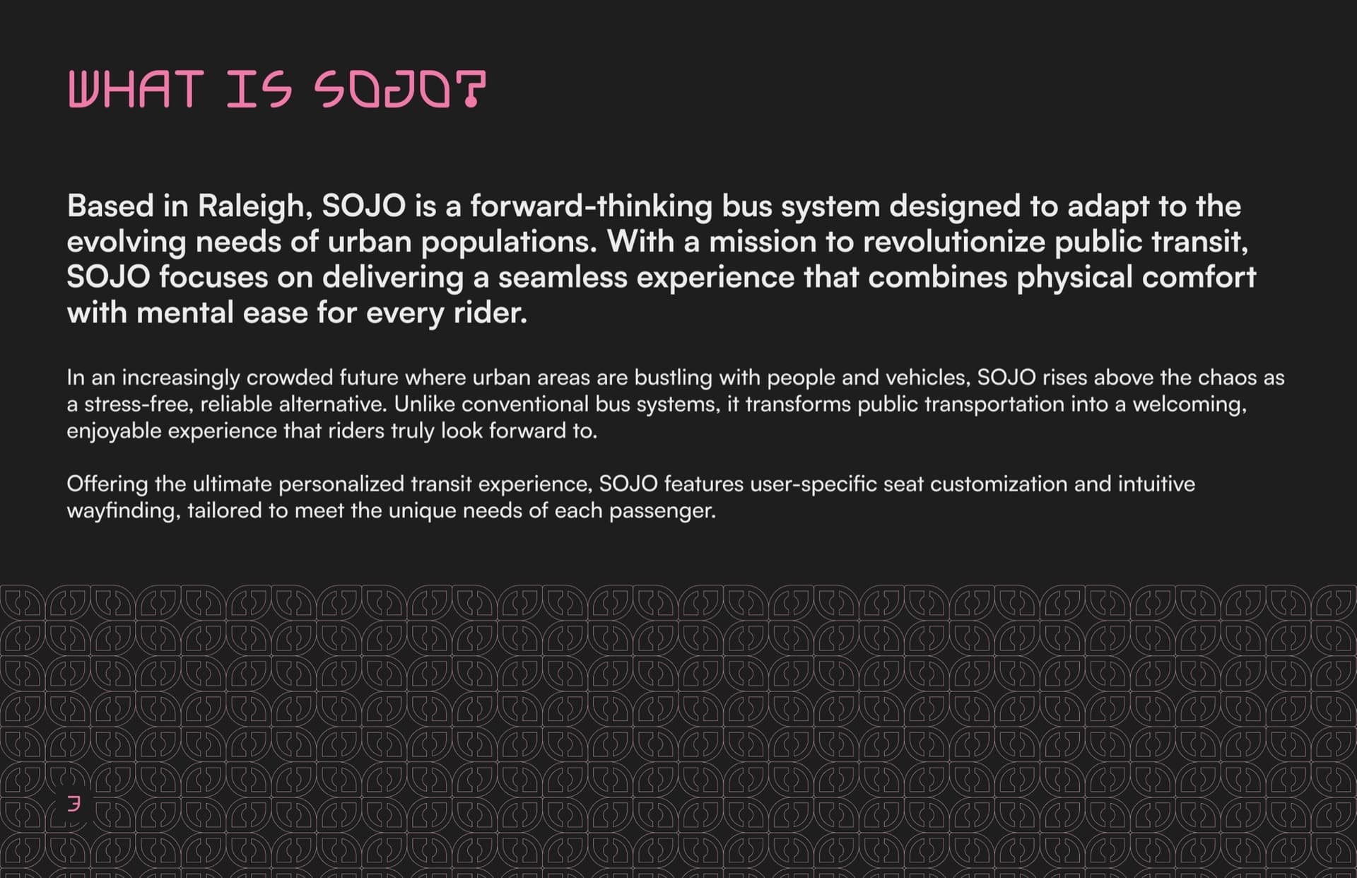
SOJO, short for "sojourn," is a speculative transit brand imagining what a bus system in Raleigh, NC, could look like fifteen years from now. Built for Branding, Interaction, and Service Design, our team of three was given an open brief with one focus: transportation. What we delivered was a complete brand system anchored by a custom typeface, a full icon library, motion assets, patterns, and product prototypes, all speaking the same visual language.
My role centered on brand identity direction, the custom typeface Sojourn Display, and the icon set. Every piece of the system traces back to one mark (and one happy accident).
01 · Research
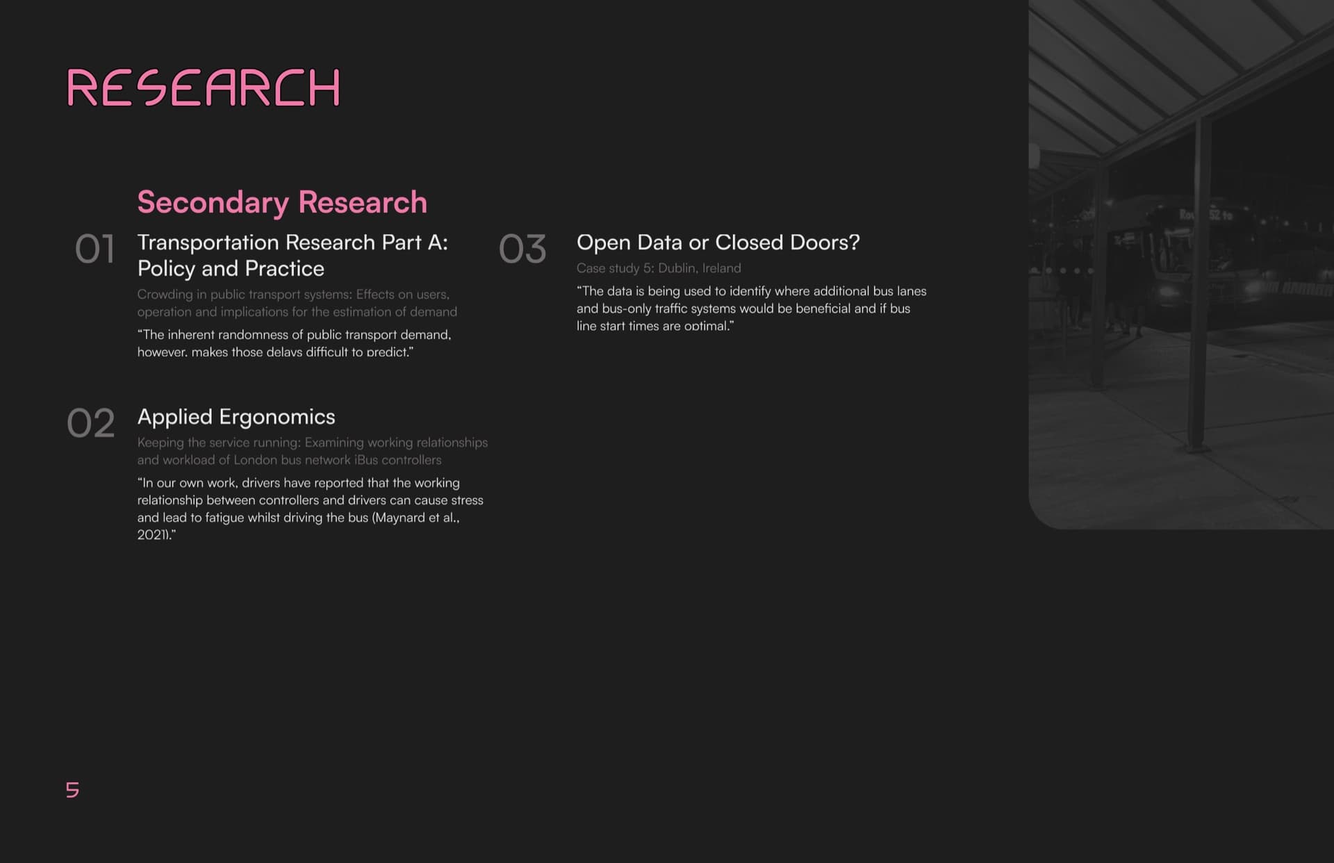
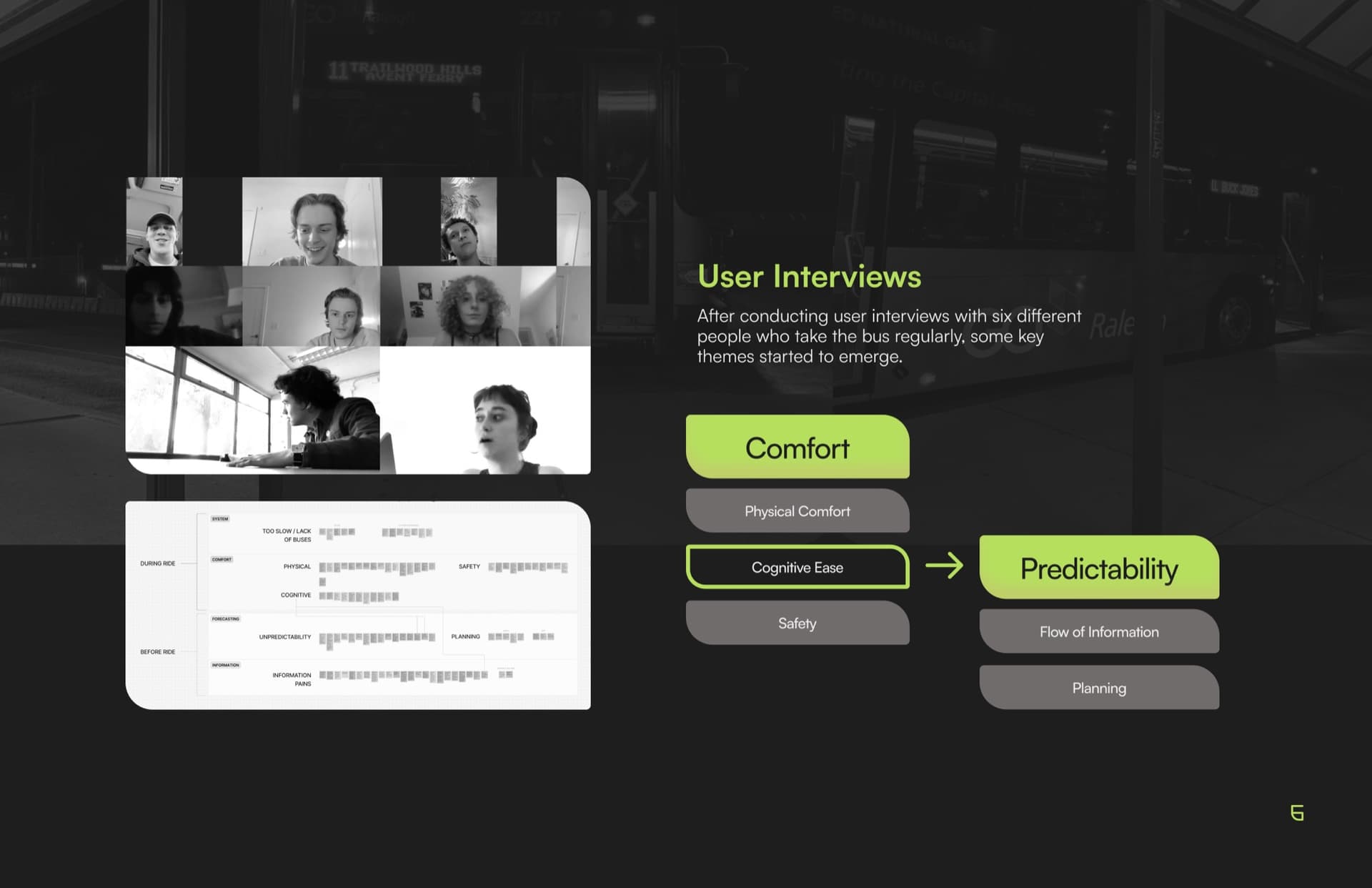
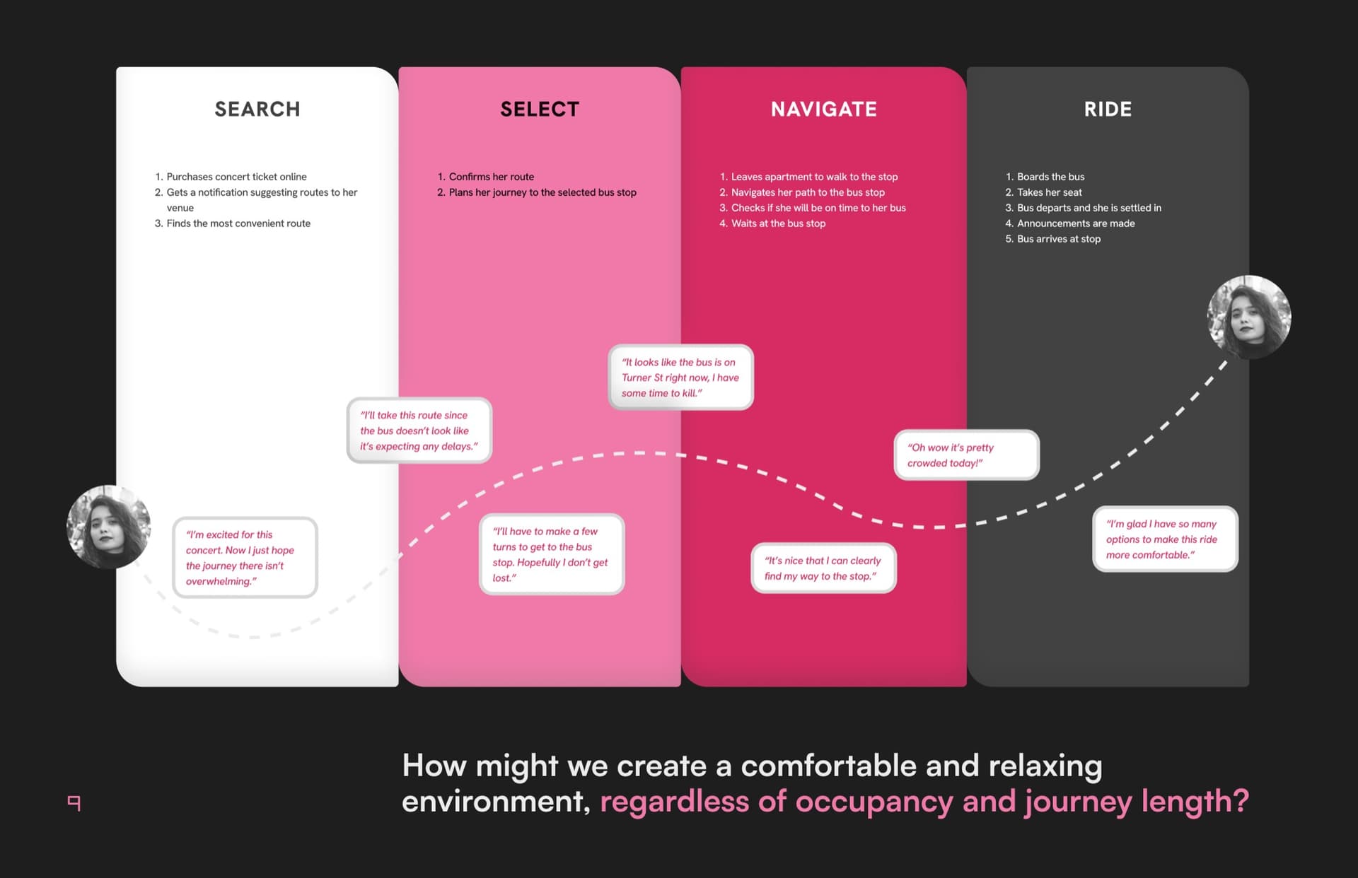
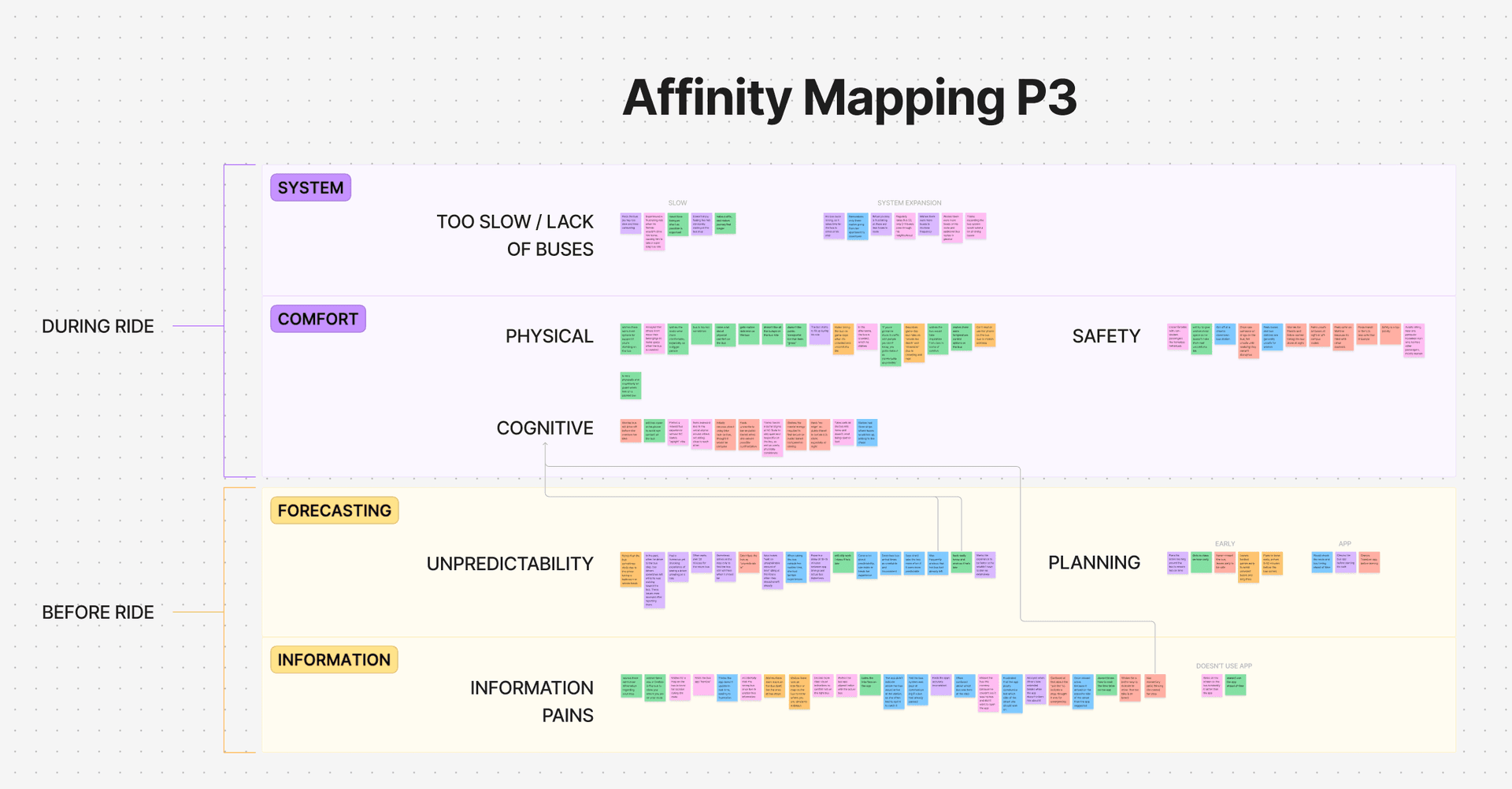
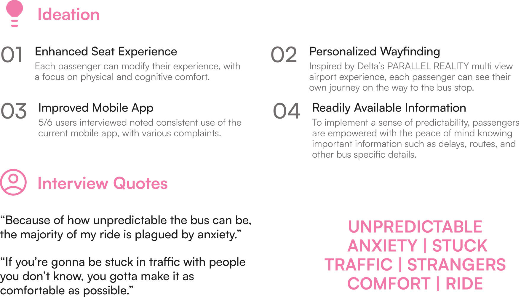
We interviewed six regular bus riders and backed it with secondary research across three areas: transit policy and crowding dynamics, applied ergonomics in service design, and international case studies, including Dublin's open-data bus system. We also studied speculative transit concepts to push our thinking beyond the conventional.
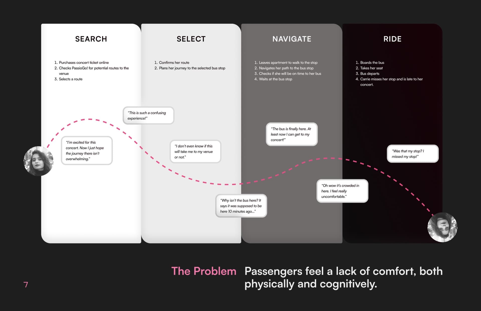
The interviews told a consistent story. Riders' pain points weren't mechanical: they were emotional. Uncertainty about arrivals, discomfort in shared space, and a loss of personal control made even short rides feel stressful. Key themes: Comfort, Cognitive Ease, Predictability, and Flow of Information.
Our HMW: "How might we create a comfortable and relaxing environment, regardless of occupancy and journey length?"
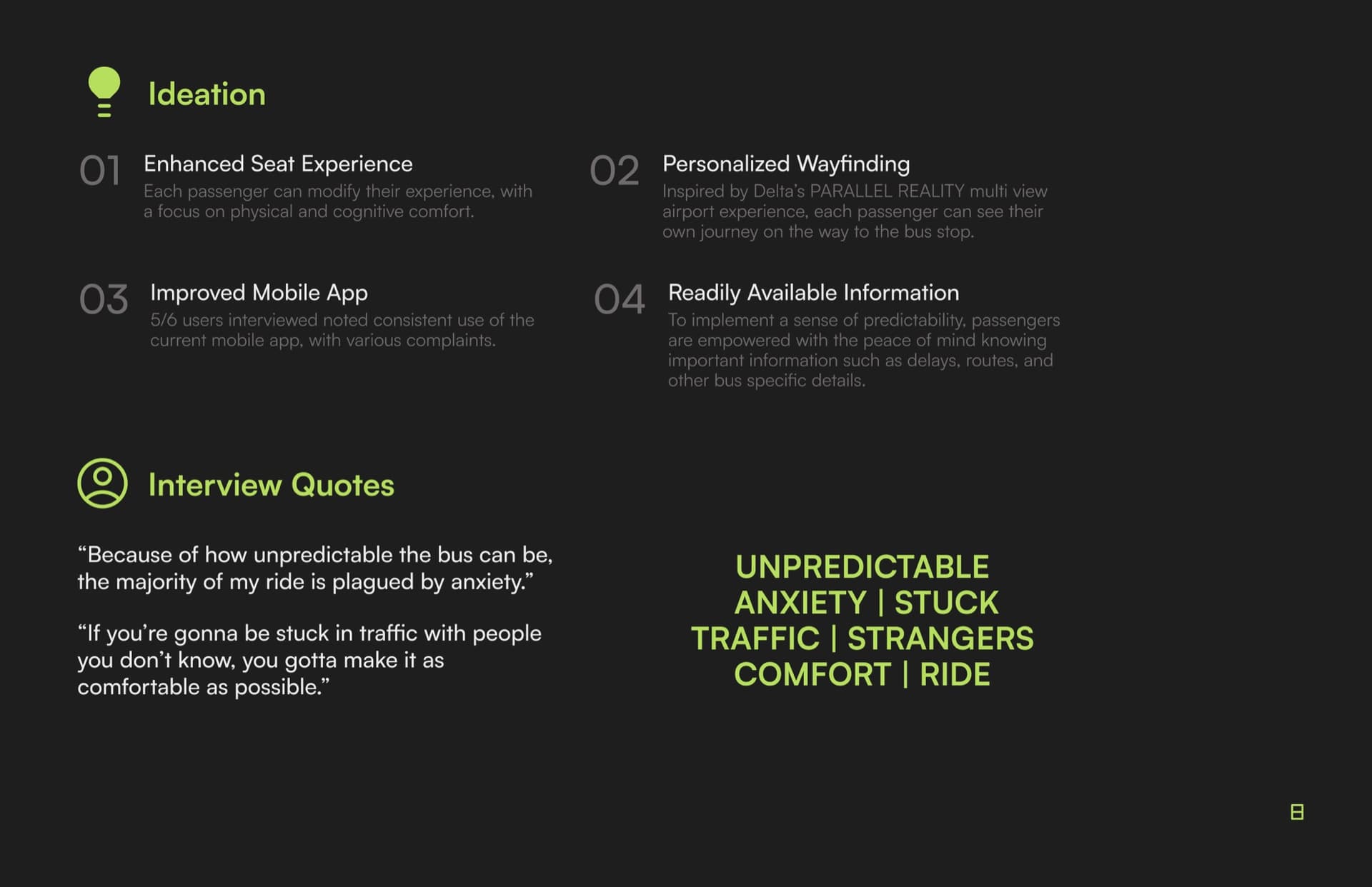
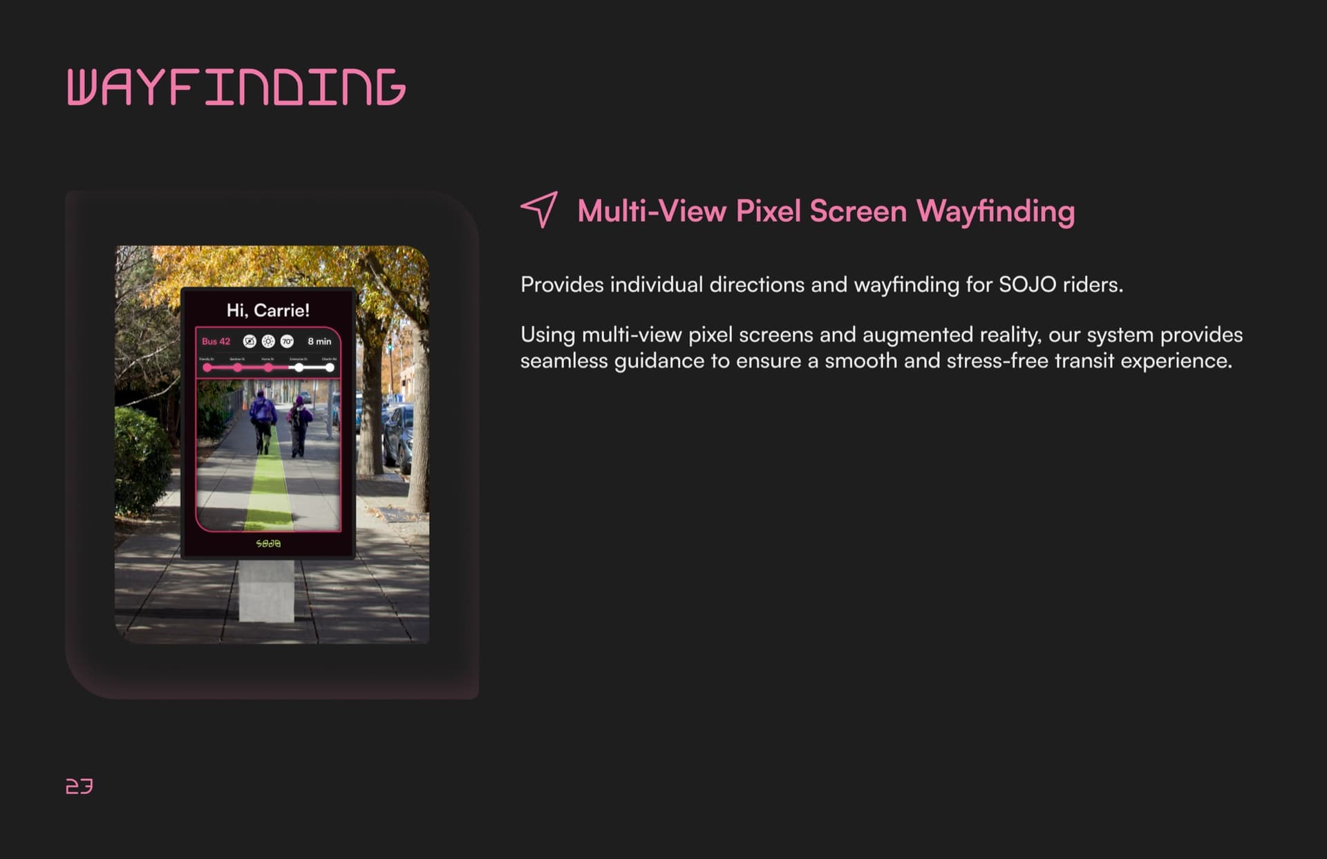
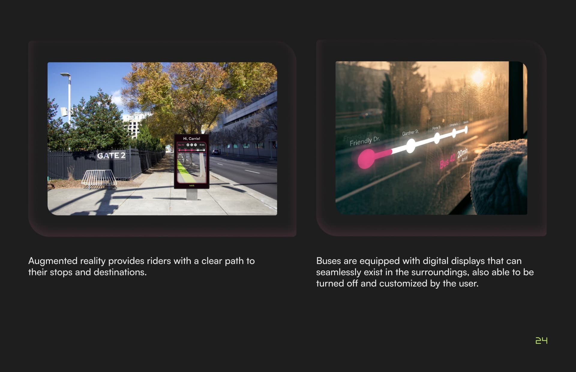
From there, we mapped four opportunity areas: enhanced seat experience, personalized wayfinding, improved mobile app, and readily available information. These all pointed back to one underlying need: predictability and agency.
02 · Brand Identity
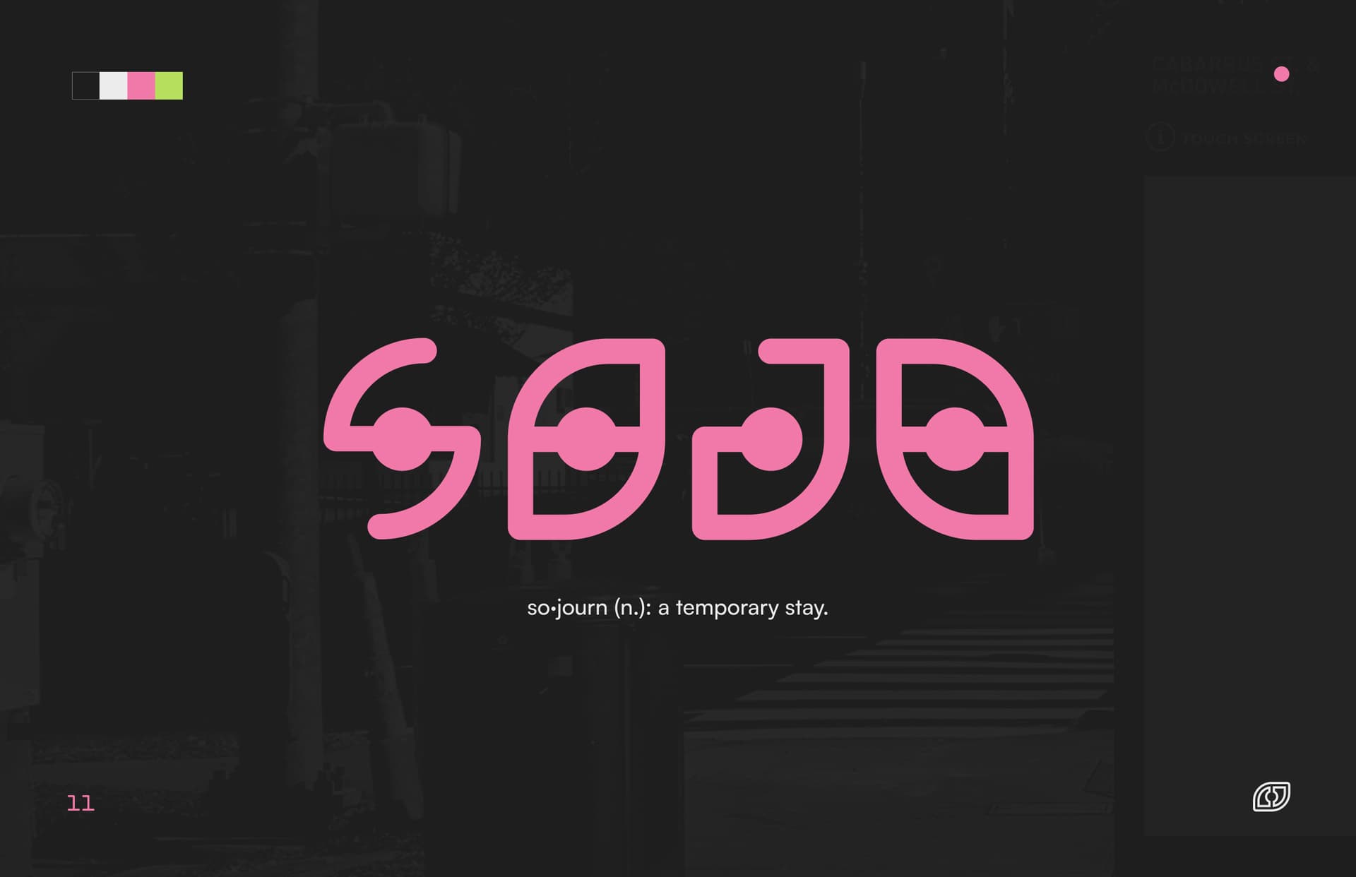
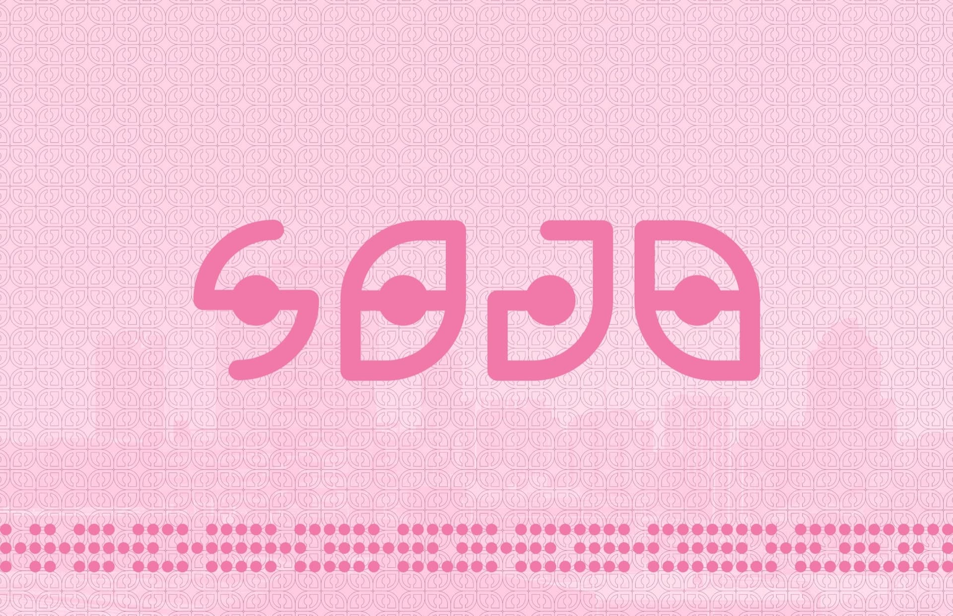
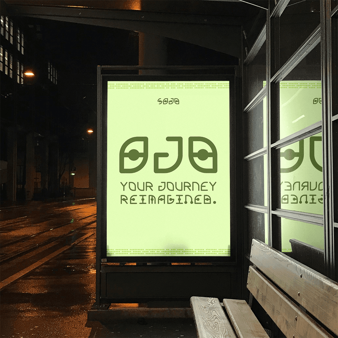
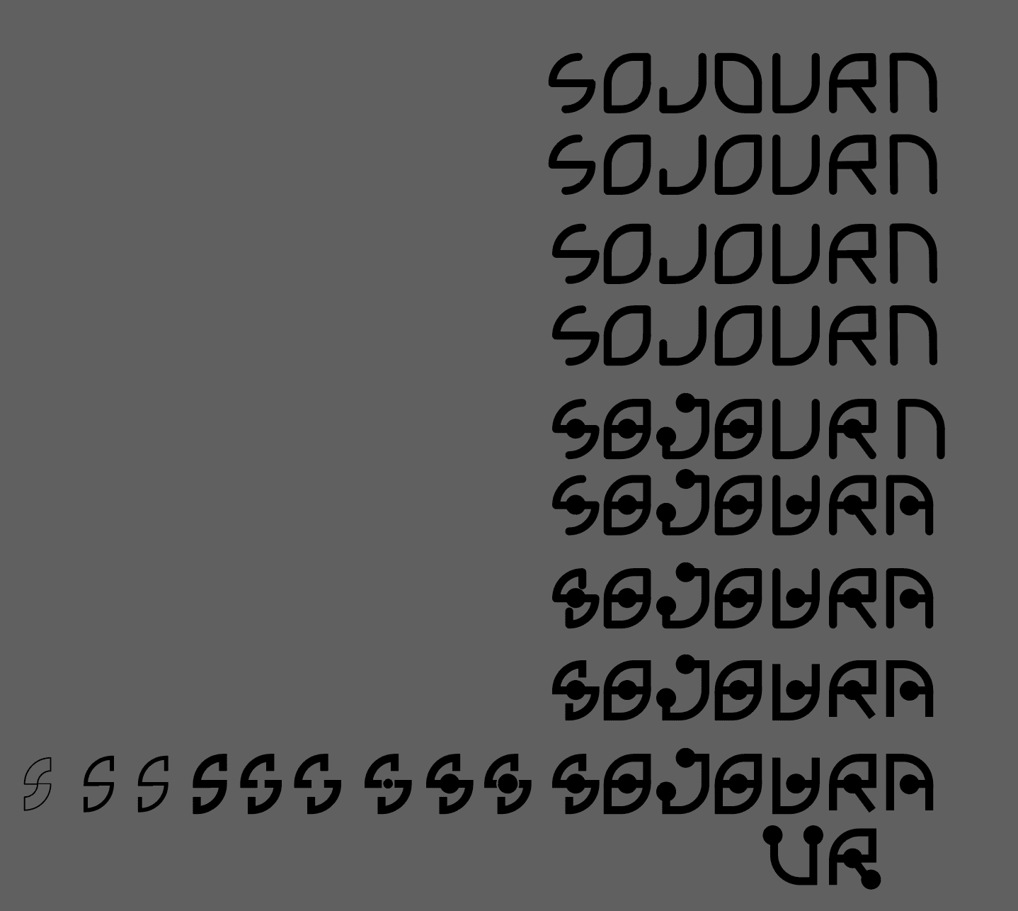
We started with the name Sojourn. As I developed the logotype, building each letterform on a consistent circle-and-curve grid, something unexpected emerged. The four characters read as a face: two eyes and a nose. The O's became eyes, the J a nose.
That discovery changed everything. We shortened the name to SOJO because it made the face more legible and more iconic. What started as a happy accident became the conceptual core of the entire system, and gave the project its new name.
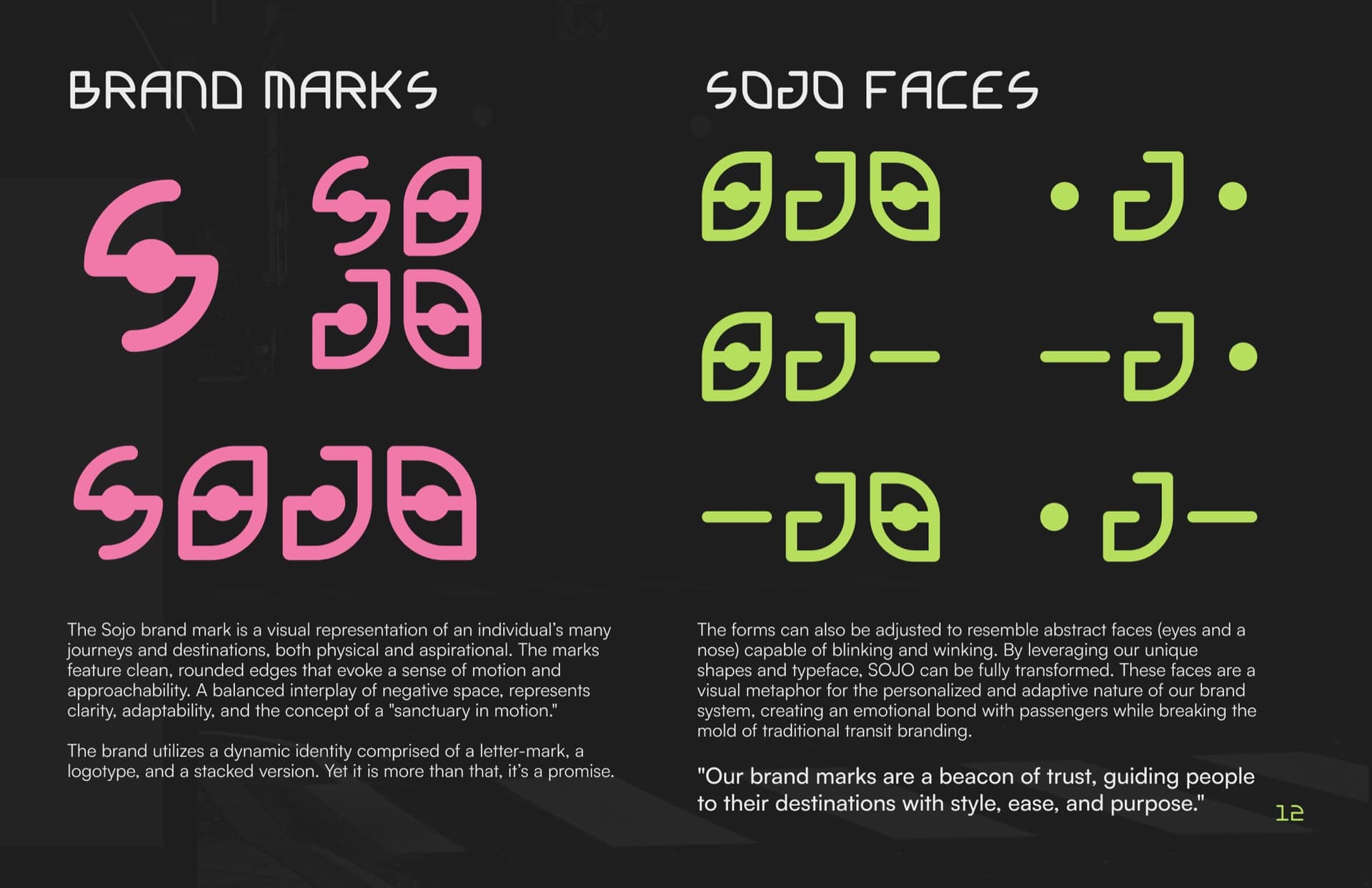
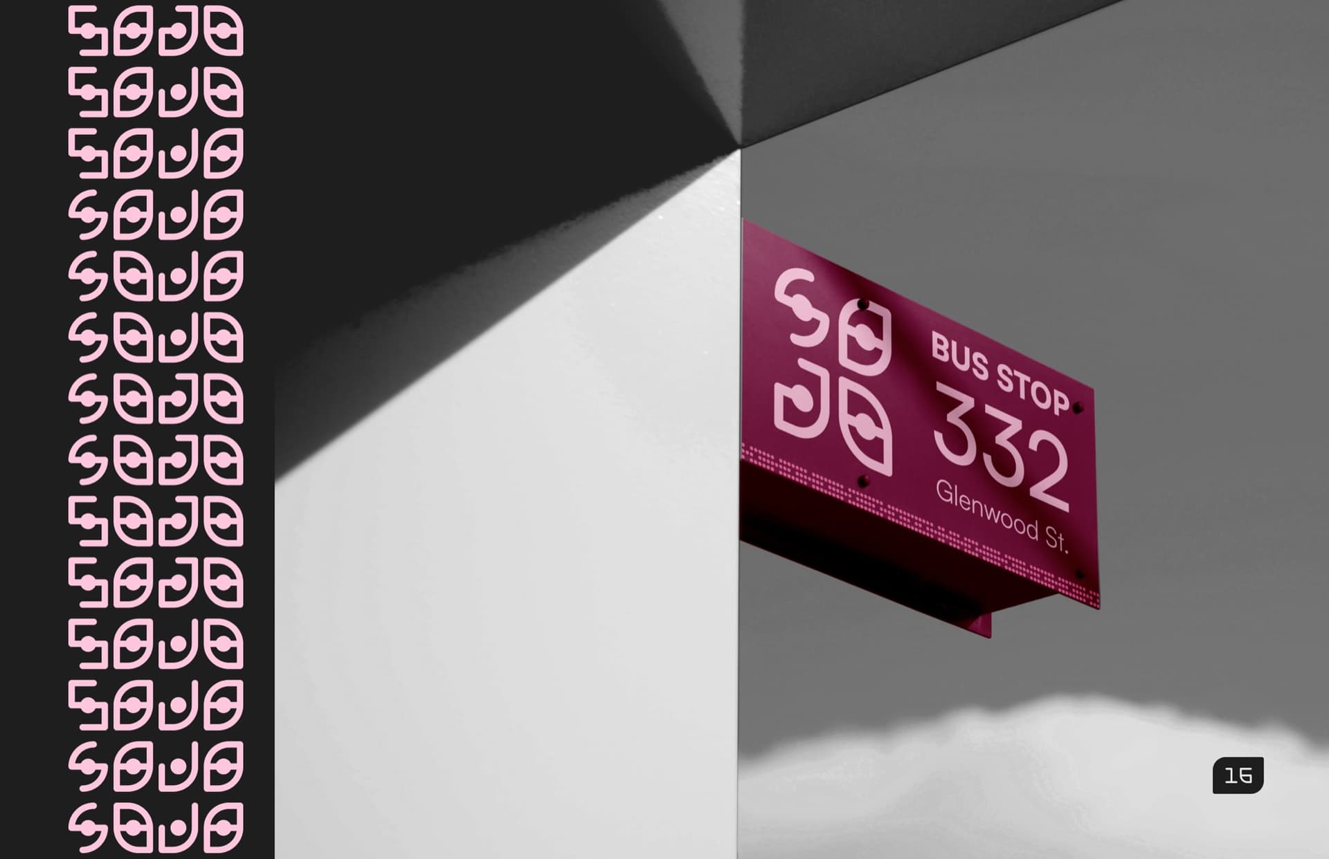
The mark system includes a lettermark (S), a stacked logotype, and the full wordmark, each designed to flex across contexts. The "SOJO Faces" variant extends further: the O's can blink, wink, and shift expression, making the brand animate-ready and deeply personal.
03 · Color
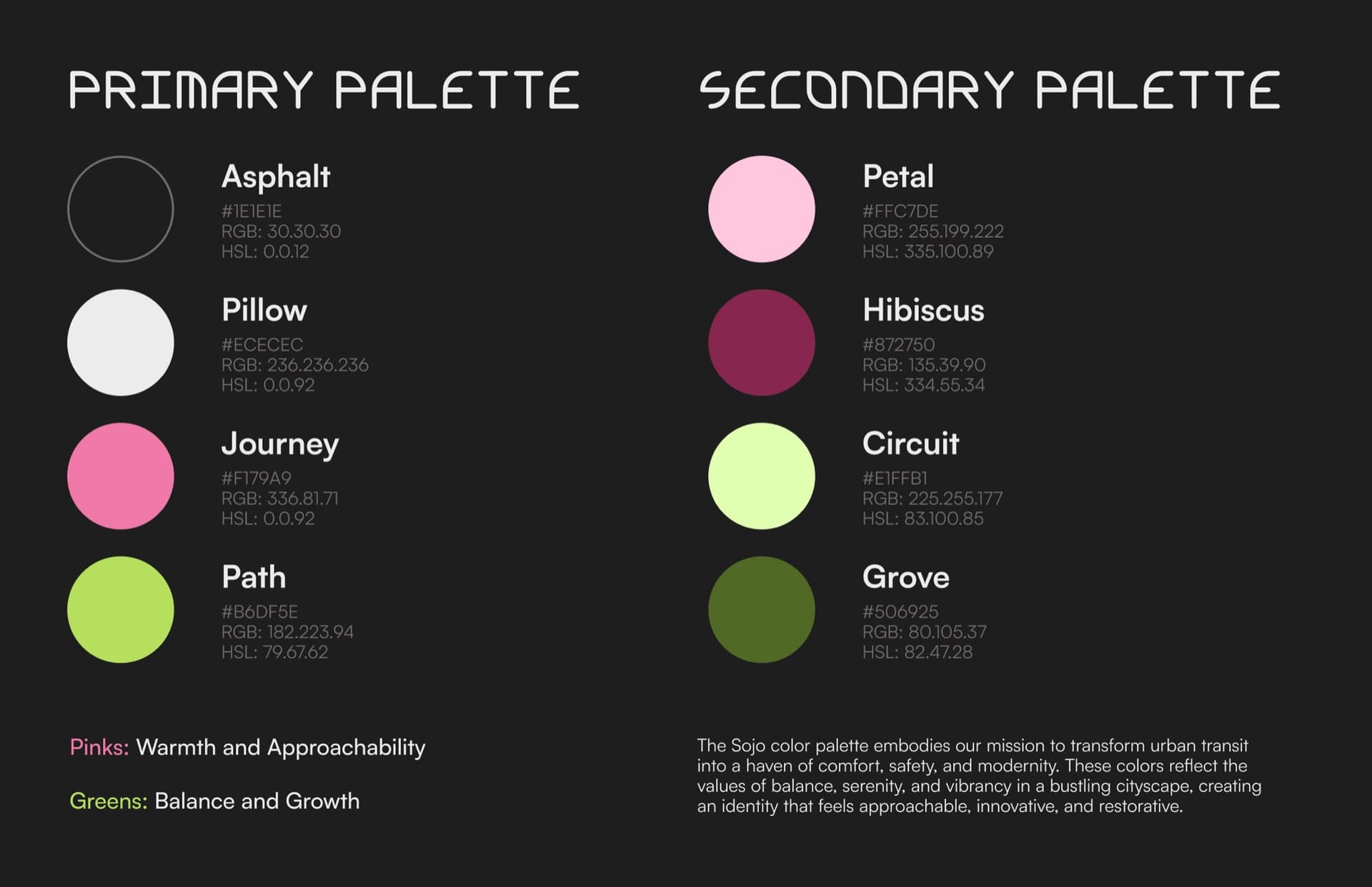
The palette started with research into calming colors and the science behind them. We wanted riding SOJO to feel peaceful as well as unlike any existing transit system, and the research let one choice do both jobs. Journey (hot pink) and Path (chartreuse green) are the pair that survived: calm to sit inside, and nothing any city has painted on a bus.
Every color name ties back to the experience of moving through a city: Asphalt, Pillow, Journey, Path, Petal, Hibiscus, Circuit, Grove. The secondary palette extends the system for backgrounds and gradients.
- Asphalt#1E1E1E
- Pillow#ECECEC
- Journey#F179A9
- Path#B6DF5E
- Petal#FFC7DE
- Hibiscus#872750
- Circuit#E1FFB1
- Grove#506925
04 · Custom Typeface
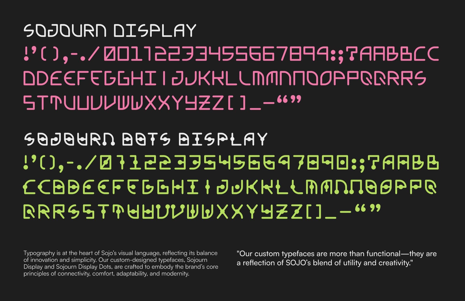
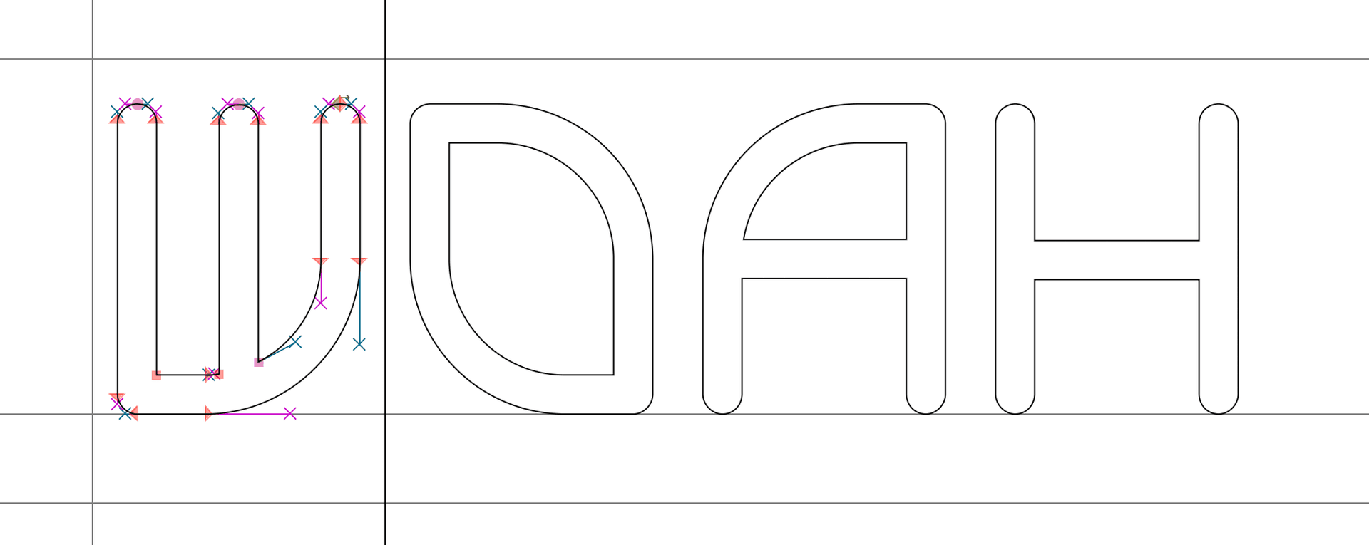
Most brand typefaces are chosen. Sojourn Display was grown from the same grid as the logo itself.
Every glyph is built on a 4×4 construction of rounded rectangles and circular terminals, the exact same underlying structure as the SOJO wordmark. The strokes are the journey. The dots are the destinations. I wanted the brand to be structural and decorative simultaneously. Every character carries the same spatial and stylistic DNA as the mark, so the brand can be set in copy and still feel like the brand.
I designed two styles: Sojourn Display (clean strokes) and Sojourn Display Dots (dots at every intersection, directly mirroring the logo's construction). Both are the same weight, the only difference is the presence or absence of the destination markers. The typeface also includes custom alternates and extended glyph coverage across the full character set, numbers, and punctuation.

05 · Icon Set
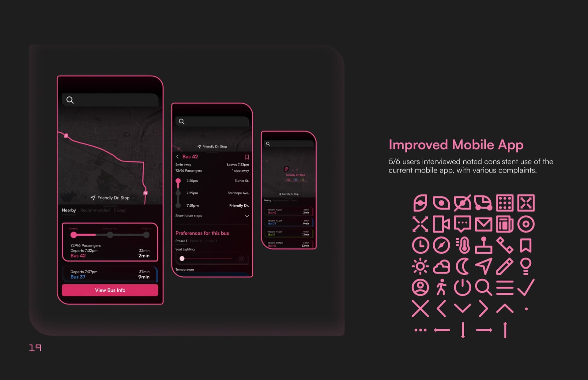
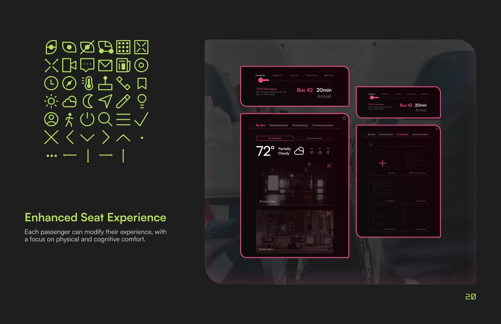
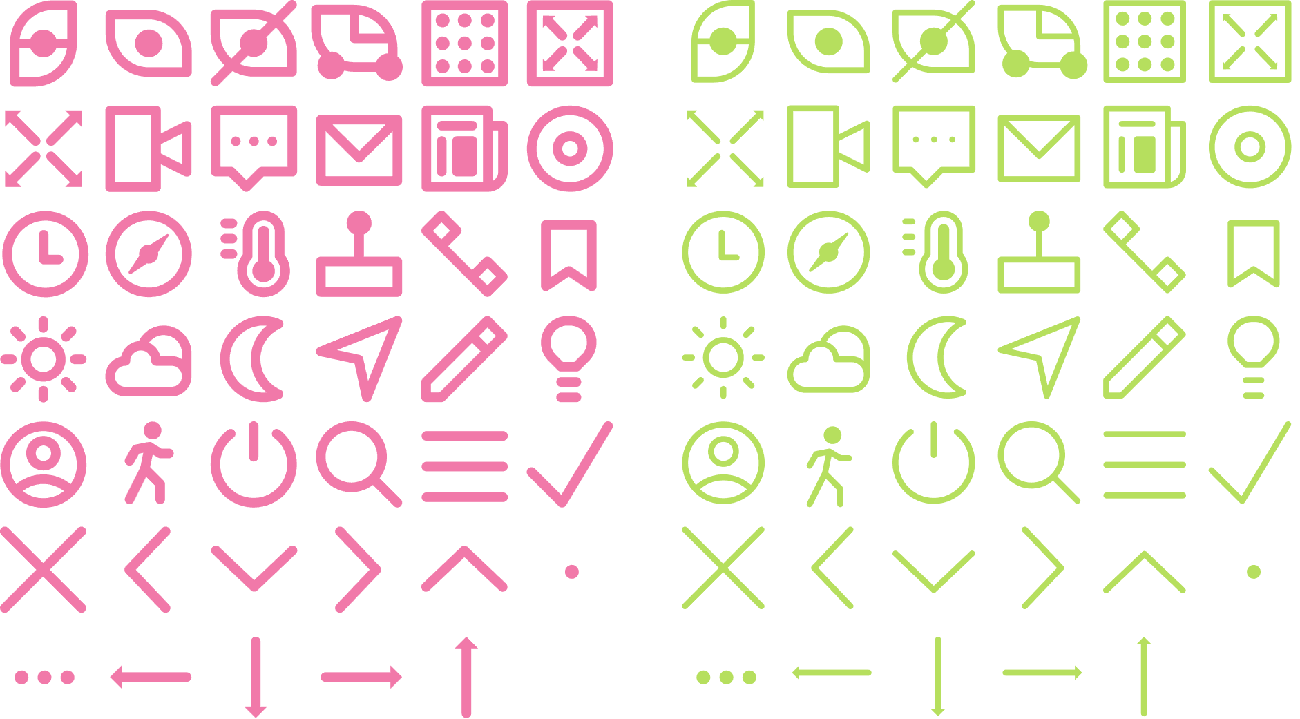
The icons exist to prove the system could live past the logo. Susan Kare's Mac icons are the bar I measure against, a whole interface carried without words, and on every identity I try to push one layer further than the marks. Torocima got an icon set; SOJO got two weights of one, because there were two surfaces to design for: the mobile app, and the seat-back screens we imagined on the buses themselves. Standard weight for one, hairline for the other, both on the wordmark's geometry of rounded strokes and circular terminals.
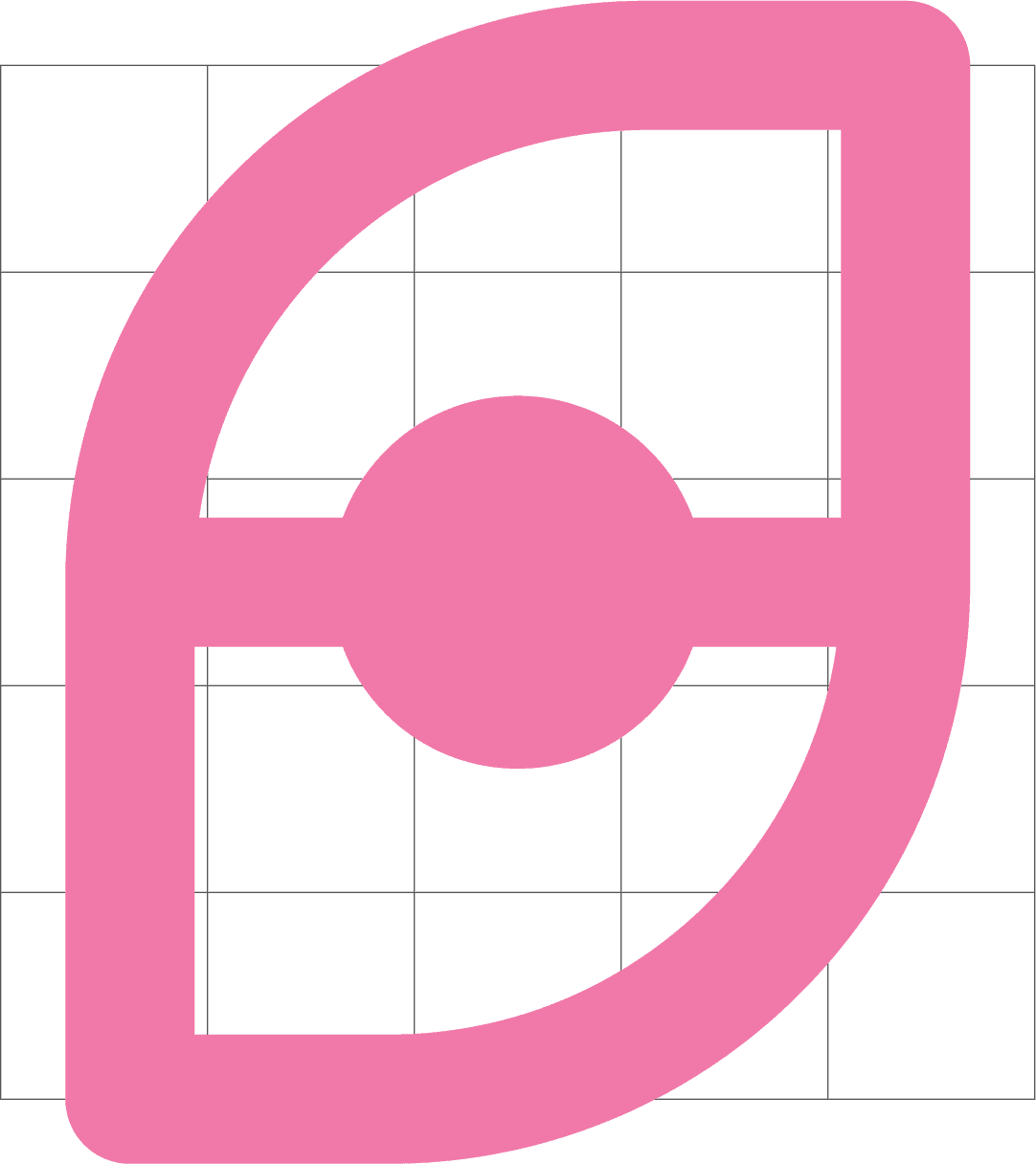
The SOJO "O", the eye from the logo, appears in the set as a literal eye icon. The mark doing functional work rather than getting quoted.
06 · Assets & Motion
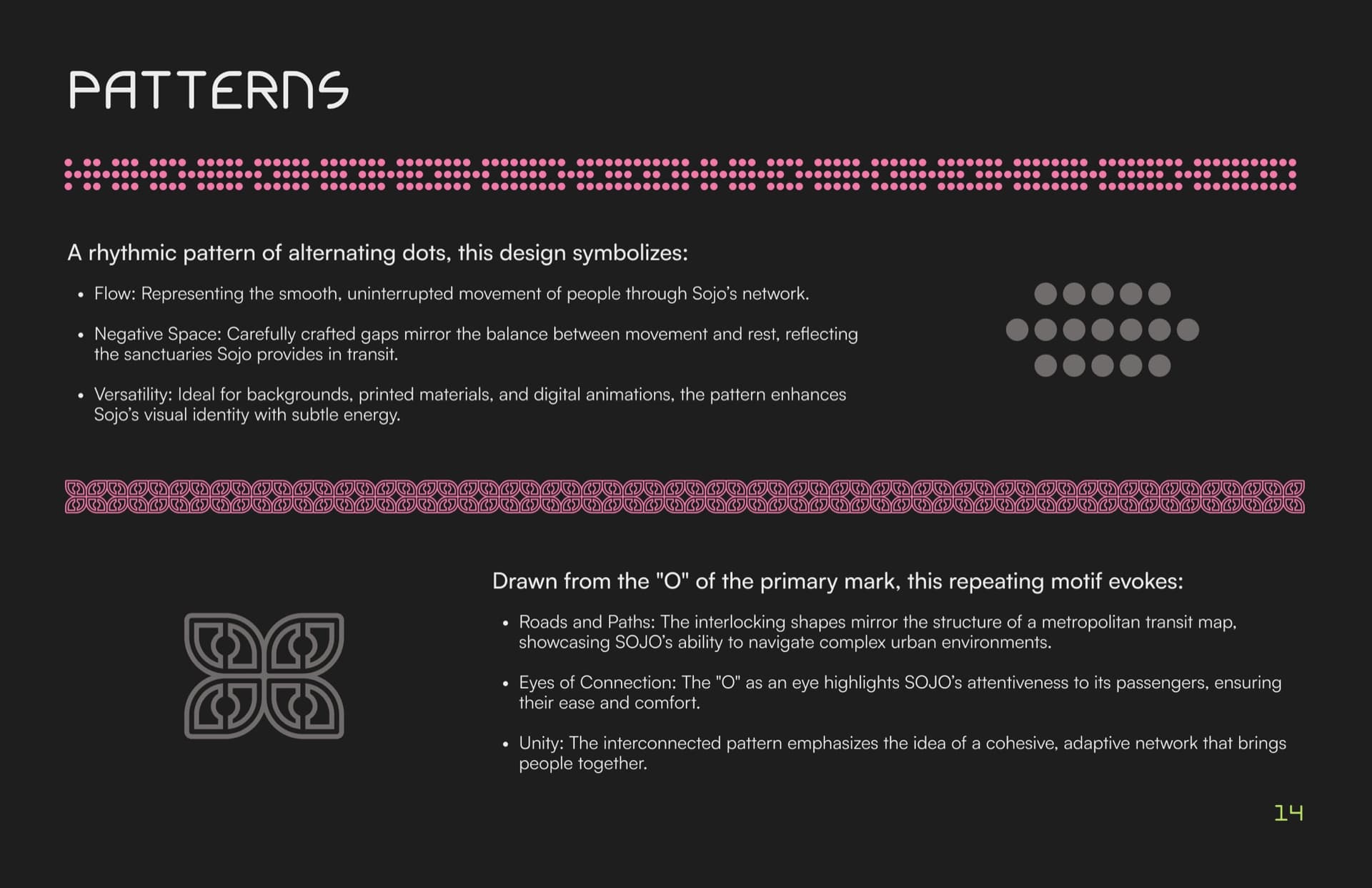
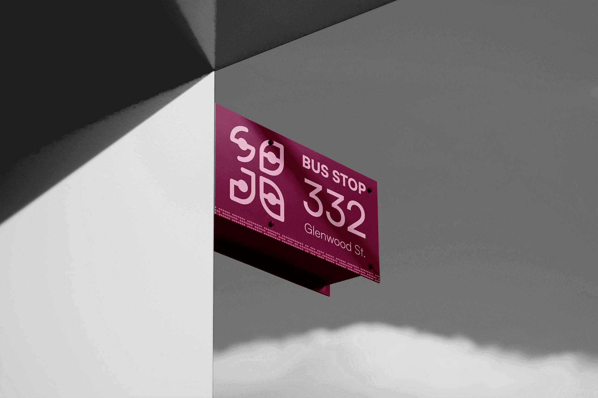
The SOJO mark tiles into two repeating patterns used across signage, tickets, vehicle surfaces, and digital backgrounds. The dot pattern, a rhythmic sequence of alternating circles, represents flow and movement through the network. The O-mark pattern, drawn directly from the primary logomark, evokes roads, paths, and eyes of connection. Both exist in primary and secondary palettes, making them flexible across any application.
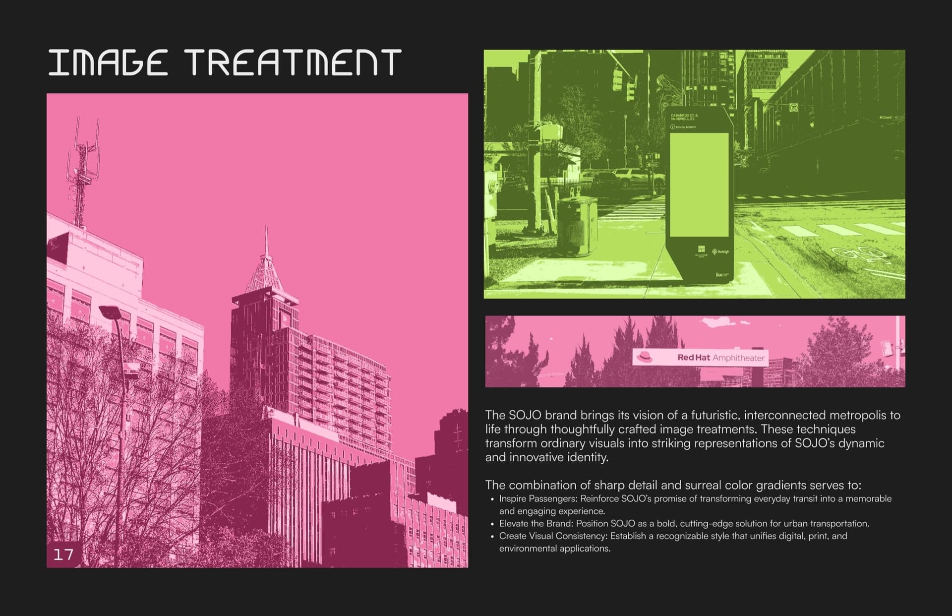
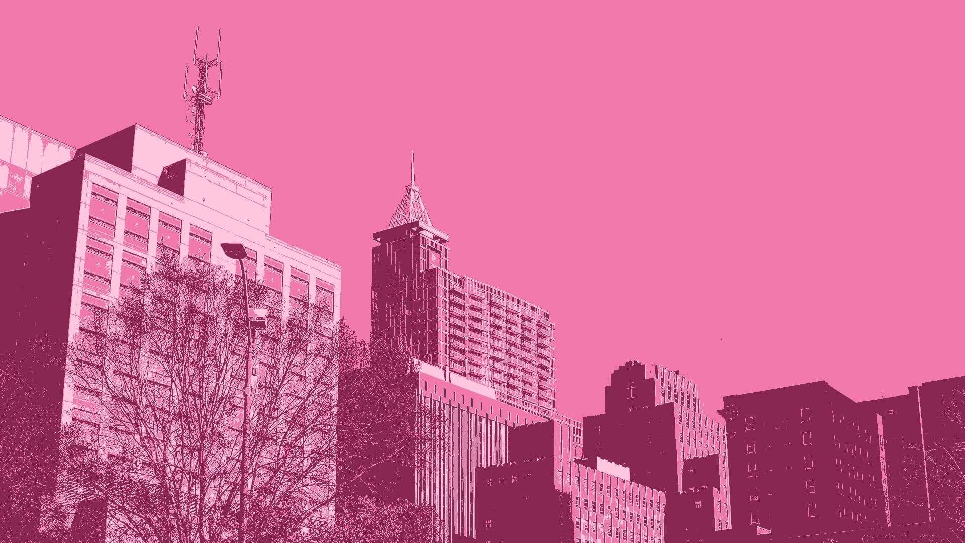
The duotone treatment was a fix before it was a style. The photography came from different sources and didn't hang together, and in critique a classmate said it read as placeholder stock next to everything else we'd made. Running every photo through one brand ink, Journey pink or Path green, pulled them into a single voice.
Motion was the skill I wanted out of this project, and I used After Effects to get it: the dot travelling around the mark is AE. The rest I got to the deadline faster with tools I already knew, Figma prototyping animations and Photoshop timeline frame animations.
07 · Product Design
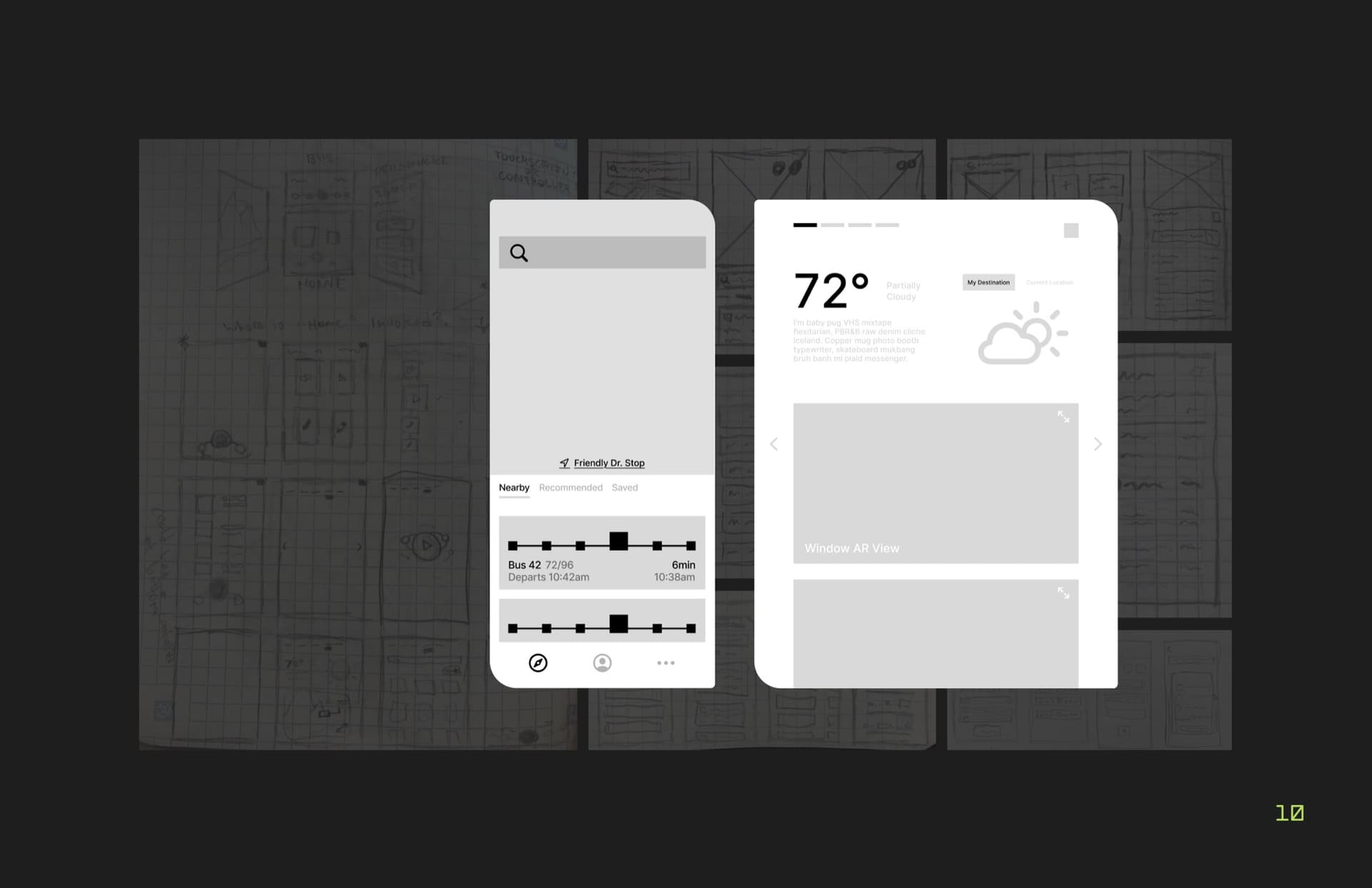
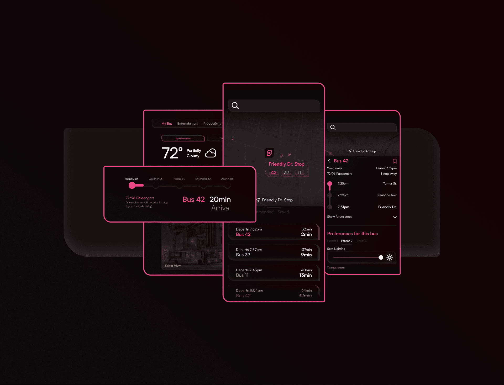
The product work covers two rider touchpoints: an improved mobile app and an in-seat display system. Both came directly from research; riders wanted predictability, comfort control, and information without friction.
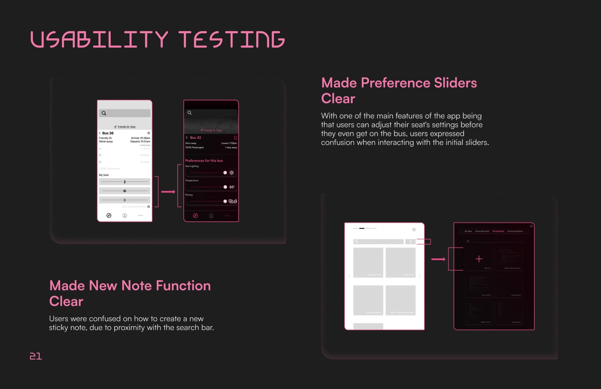
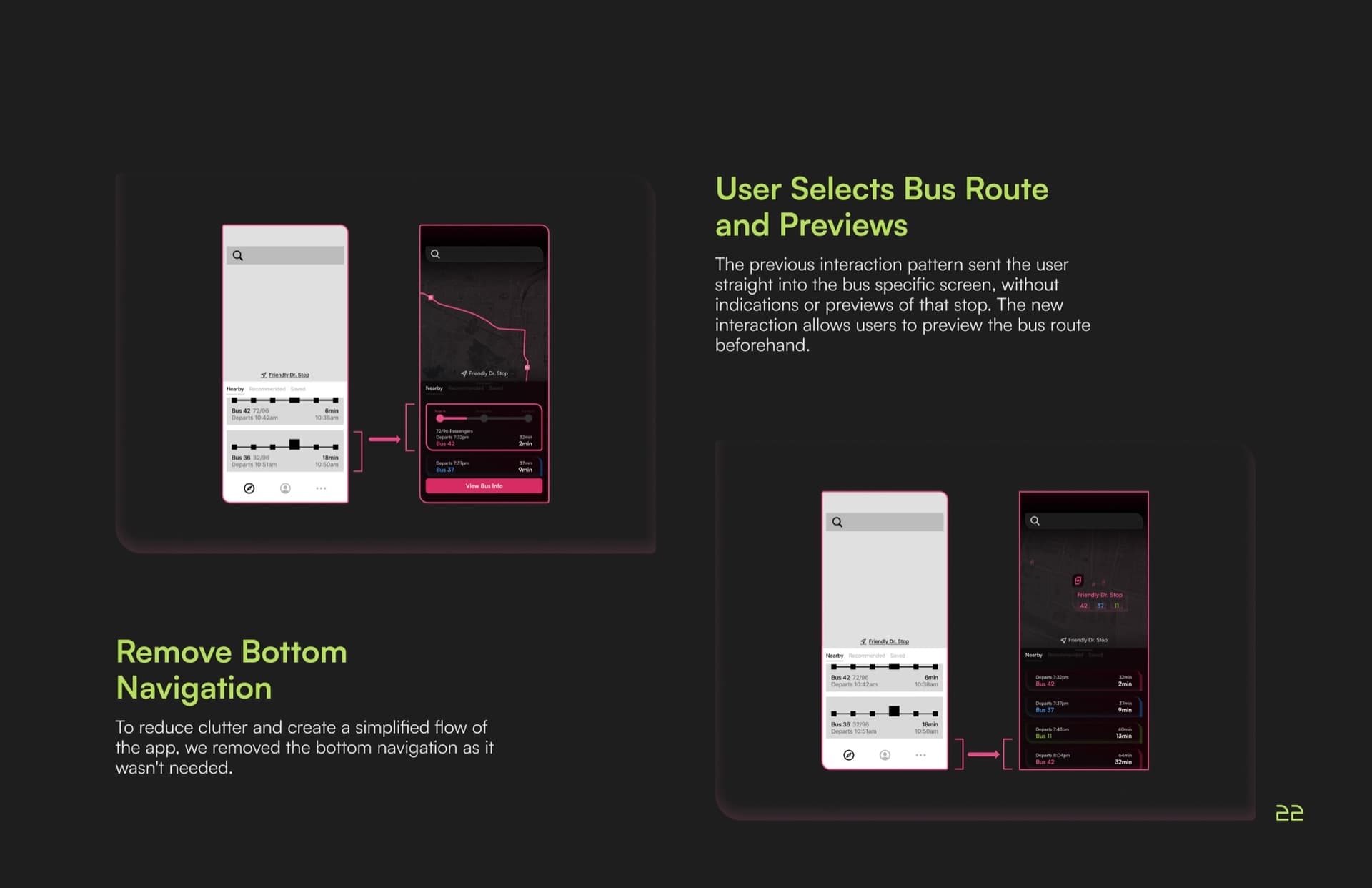
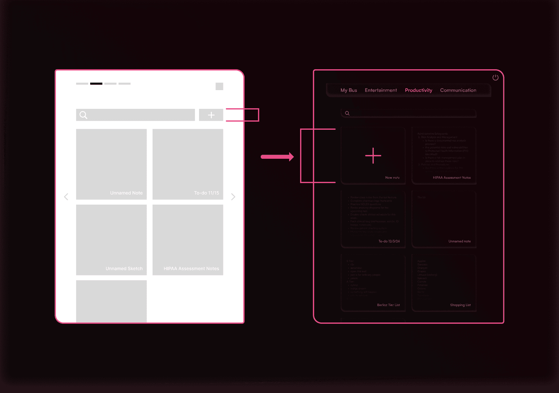
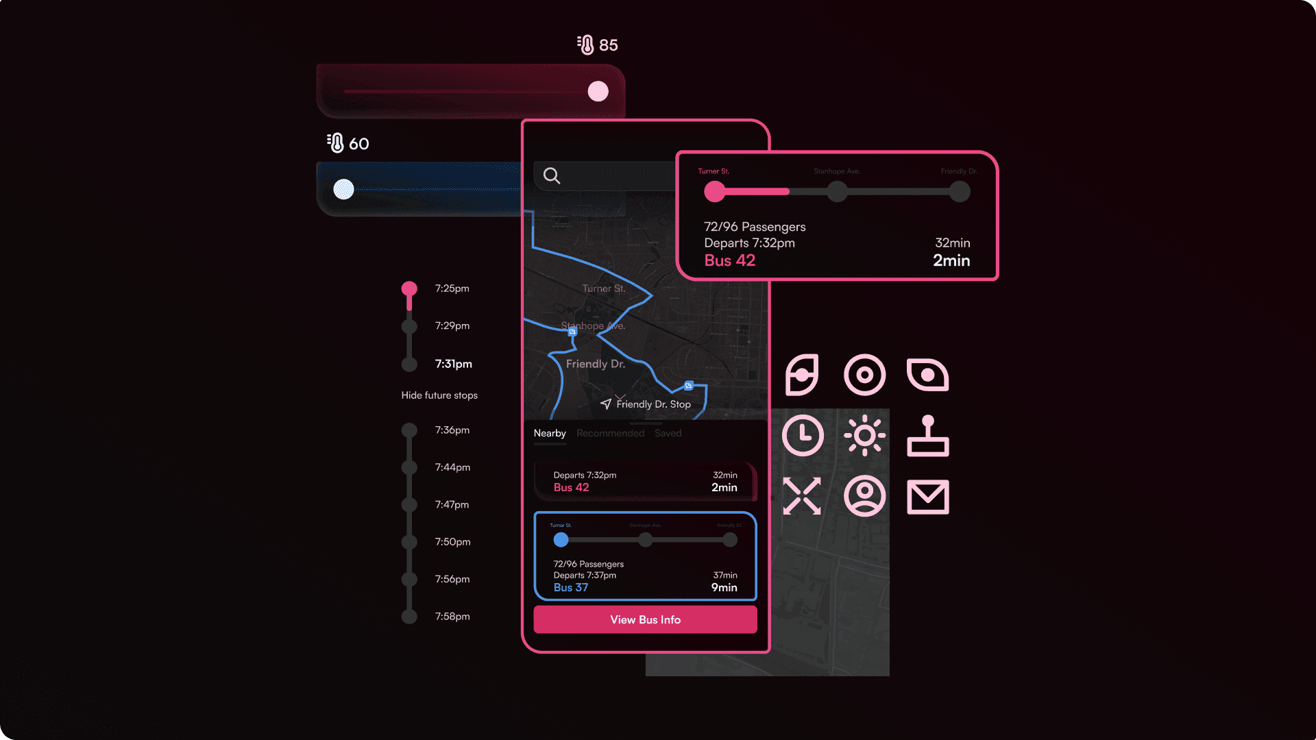
The redesigned mobile app surfaces nearby buses, real-time arrivals, and passenger counts at a glance. A dedicated route preview lets riders see their full journey before boarding (a direct fix from usability testing, where users kept getting dropped into a bus screen with no context). The in-seat display lets each passenger set their own lighting, temperature, and window view, turning the ride into something that actually feels like yours.
The product UI is deliberately dark and muted, separate from the bright brand palette, so the interface feels calm while the brand stays energetic. The custom icon set and Journey pink accents keep both worlds connected.
Reflection
SOJO is the project where I further learned what a brand system actually means: every other piece grew out of one mark and one happy accident. (Cute colors help. I won't pretend they don't.) The typeface being derived from the logo rather than chosen alongside it changed how I think about design at a systemic level.
I'm proud of the scope: a custom typeface with full glyph coverage, a two-weight icon library, a scalable pattern system, motion concepts, and product screens, all in one semester. And I'm proud that the brand doesn't need the logo to feel like itself. I want to keep building stuff like this.
What I'd push further: the prototypes. The brand is tight. The product screens aren't quite there yet. You can feel the seam where the system's consistency starts to loosen in the UI guidelines. Given more time, I'd rebuild the app and seat UI using Sojourn Display and the custom icons end-to-end. The brand earned it.
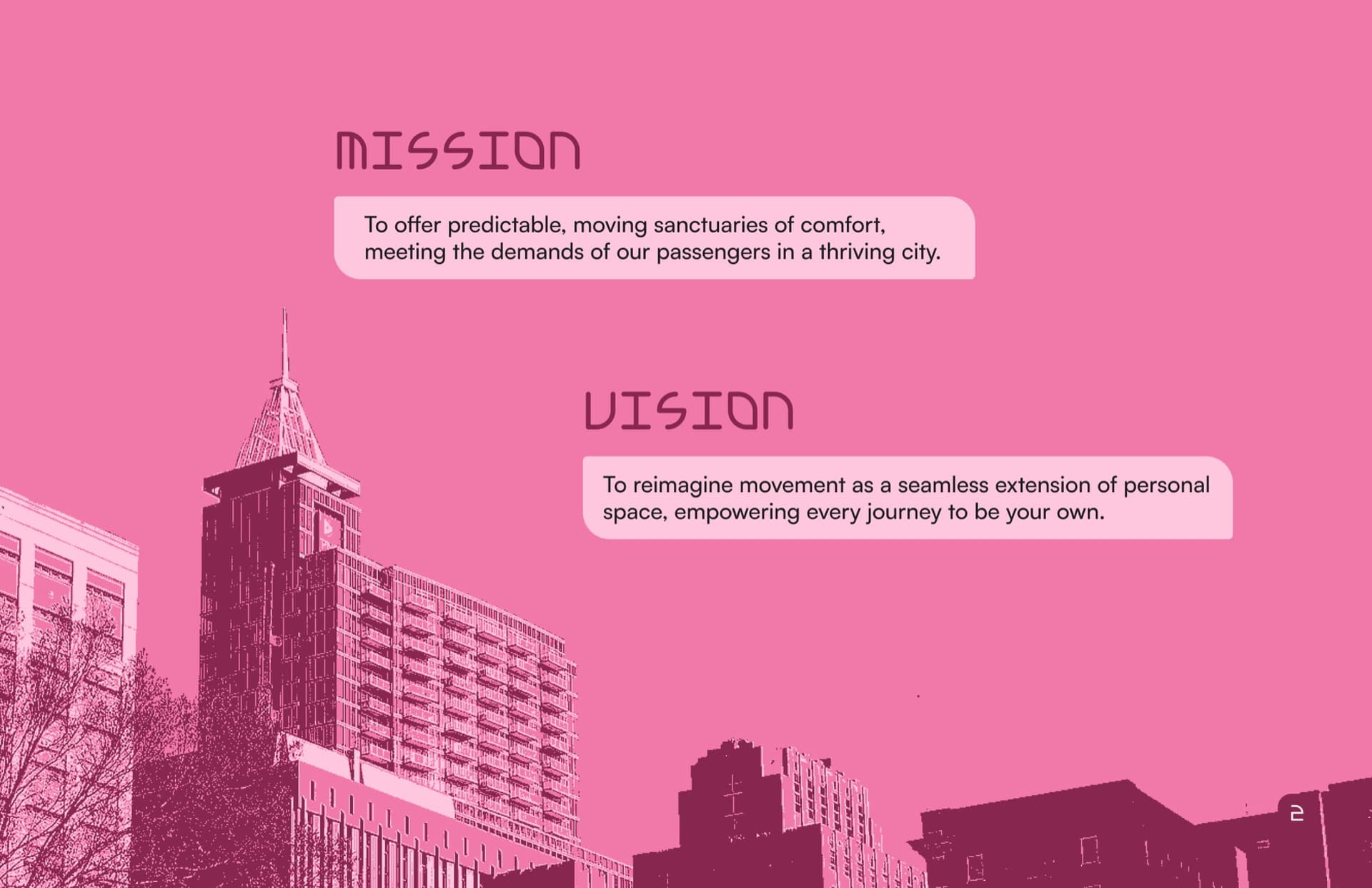
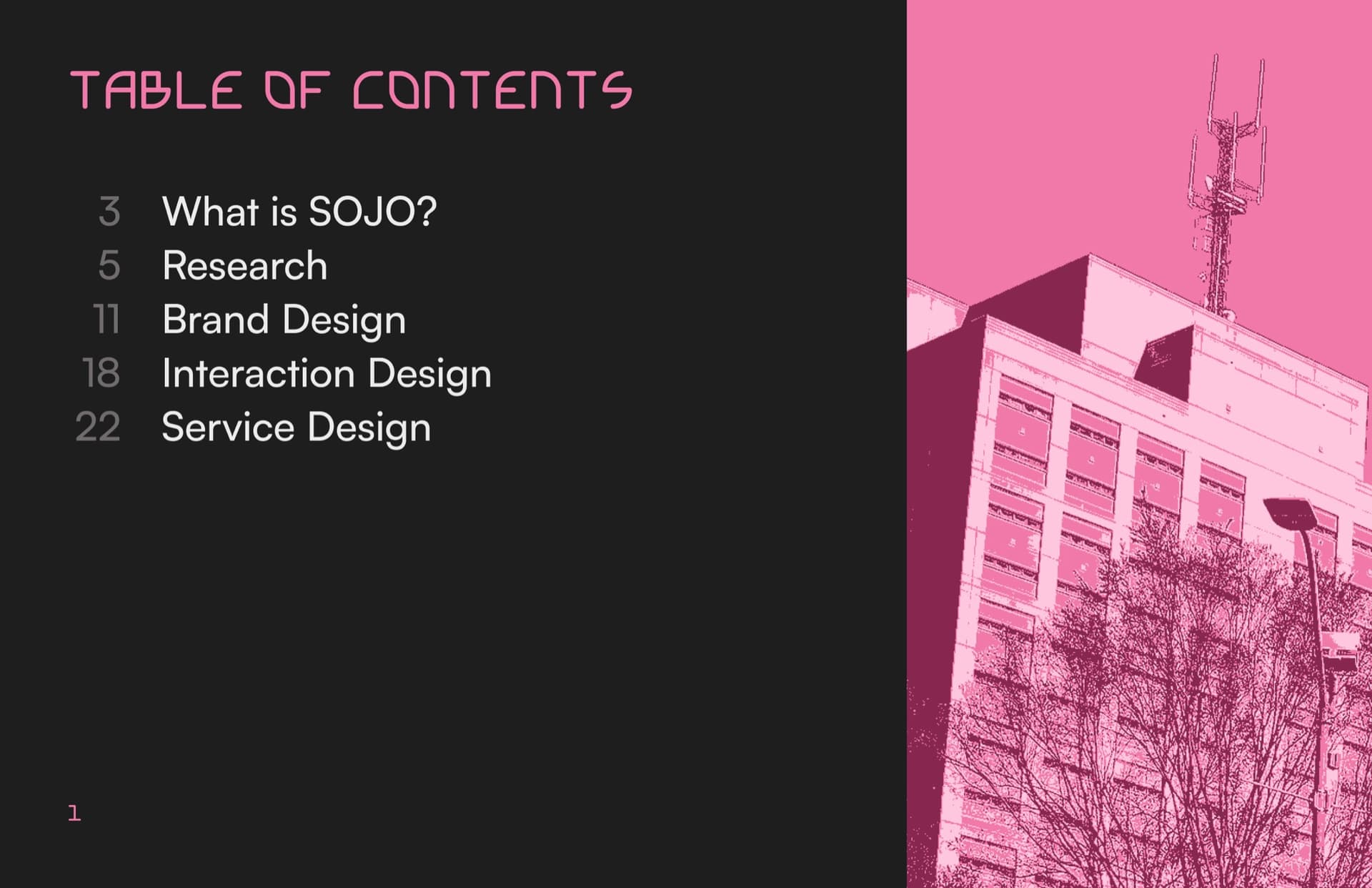
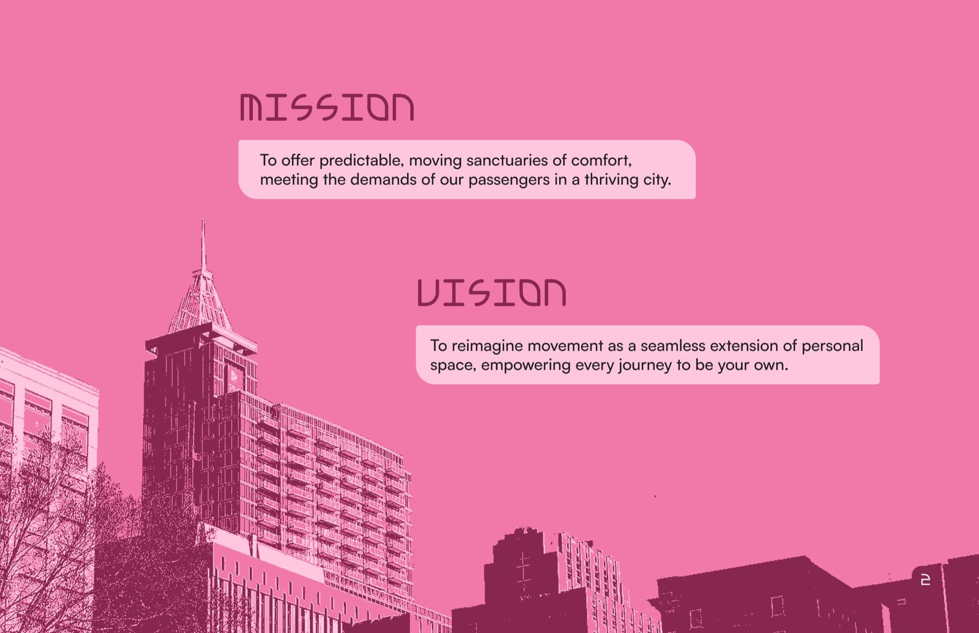
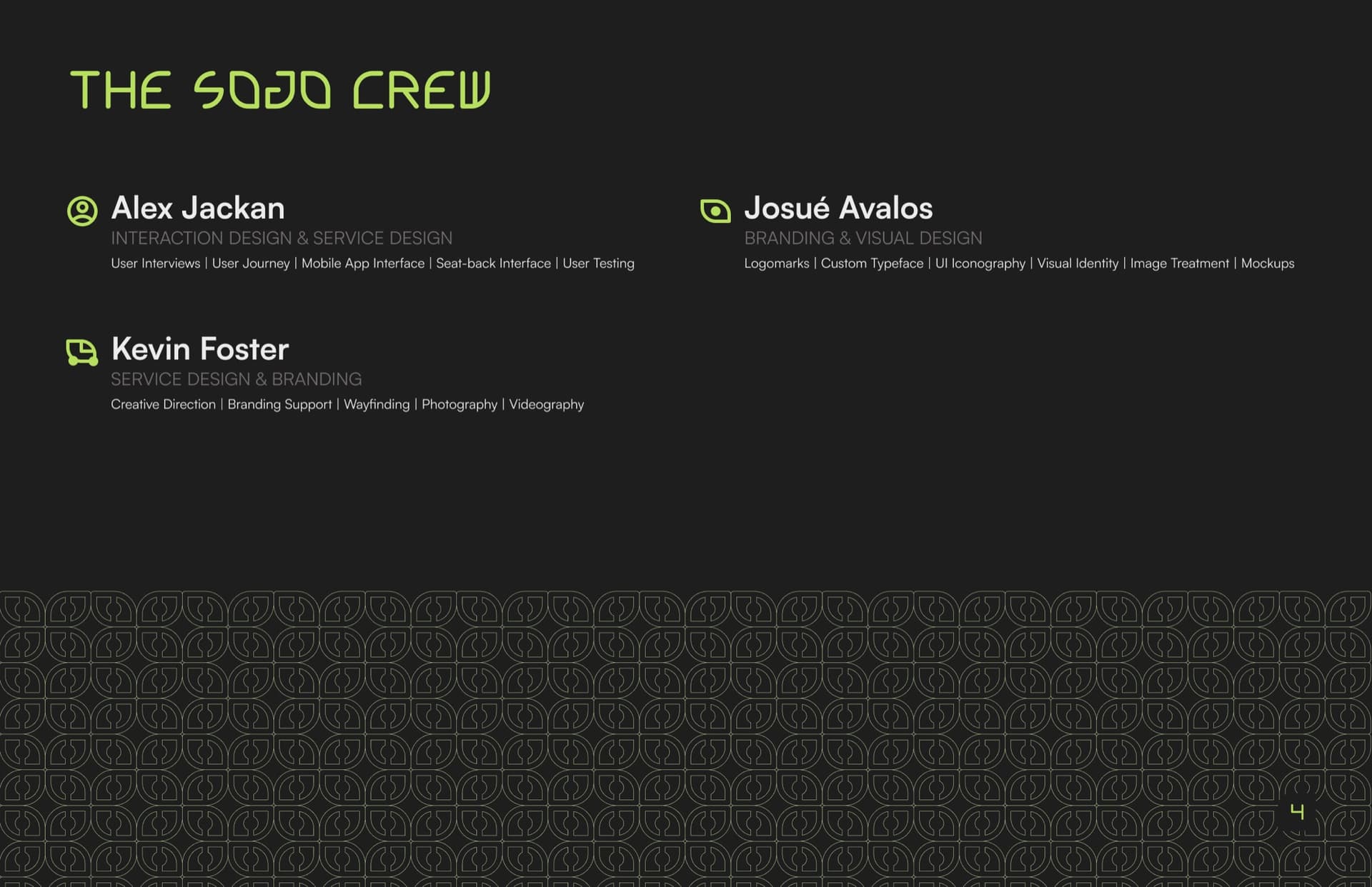
Booklet Spreads
Here are some of the final spreads that our team designed for our printed booklet. This was the last deliverable we had to complete for the class as a culmination of the work we had done for the semester. I wish I had a picture of it somewhere, not sure if our professor still has it...