

Panelware
Open source component kit
2026
Josué Avalos Jiménez
Overview
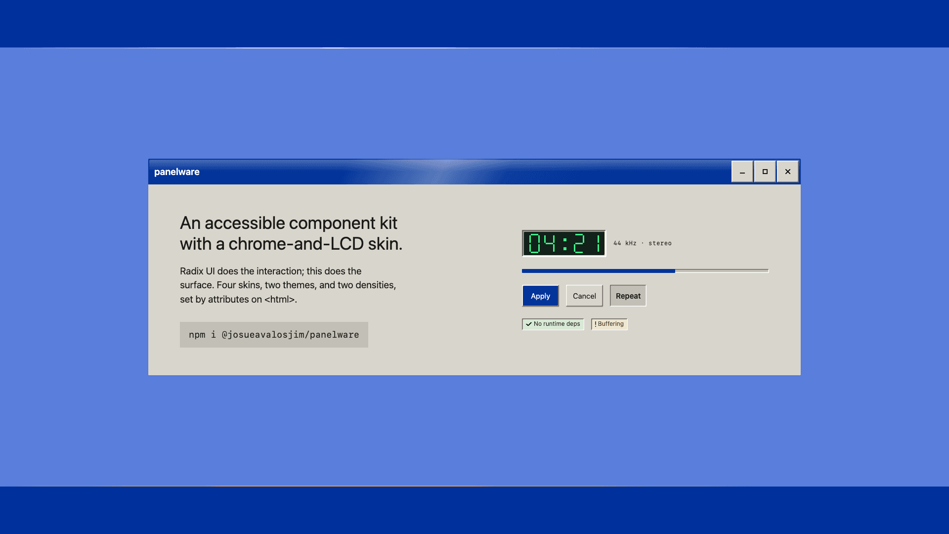
Panelware is an accessible React component kit for retro interfaces. Bevelled chrome, LCD segment readouts, a Web 2.0 gloss, and a 1998 bitmap skin, all on top of Radix UI.
It is on npm as @josueavalosjim/panelware. I designed and built it alone in September 2026, and it reached 0.9.1 in 162 commits.
looks from one set of markup. Four skins and three presets, each in light and dark
01 · Two halves of a trade
Retro kits are decorative. They put a convincing surface over a div with a click handler, and the keyboard, the screen reader, and the contrast ratio are somebody else's problem.
Accessible primitive libraries are the other half. The interaction is correct, and the surface is a grey rectangle you are expected to design yourself.
Panelware joins them. Radix handles the interaction and focus, since doing that from scratch is years of work somebody has already done twice, and Panelware draws everything you see.
02 · A music player made of it
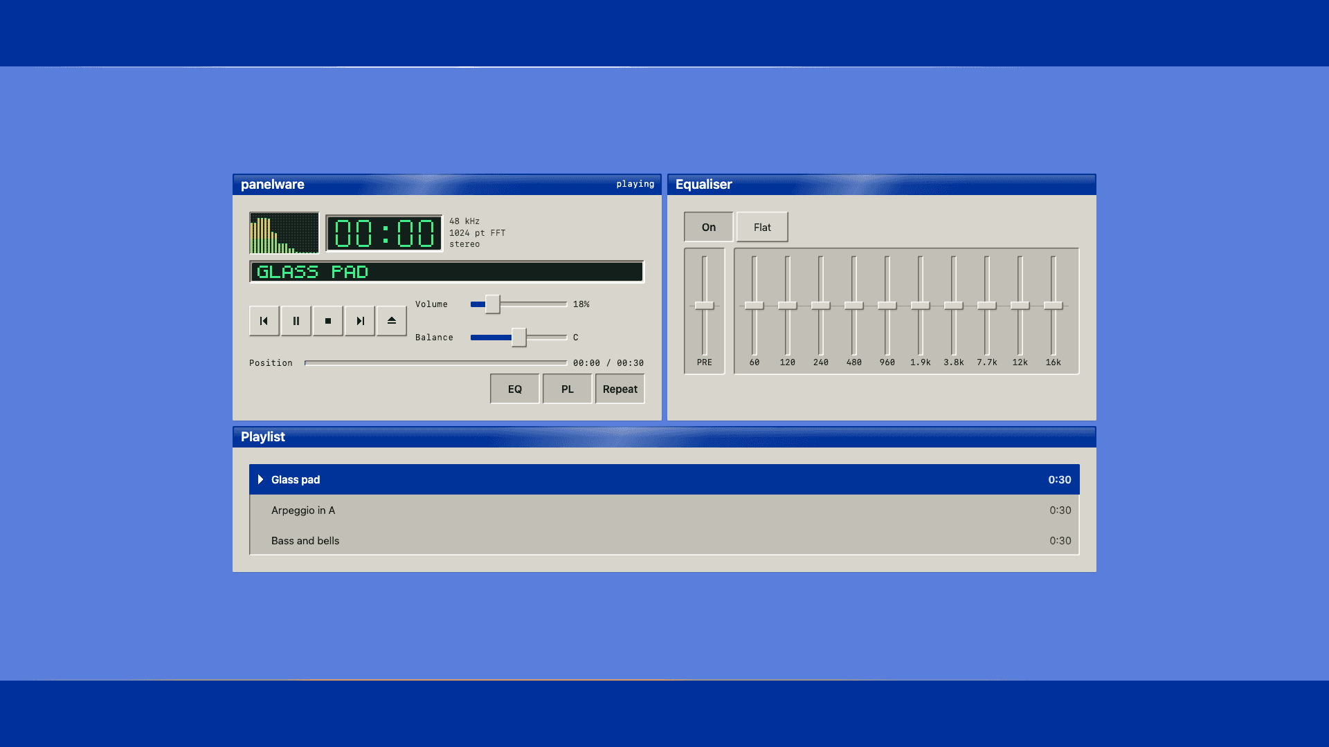
Every control in this player is a Panelware component. Press play. The music is synthesised in the browser, and the equaliser changes what you hear.
The buttons under the playlist switch skin and theme. They set the same two attributes on <html> that anyone using the kit would set.
03 · One class per element
A component is styled by the class it already has. <button class="pw-button"> is the whole of it, and a primary button adds data-variant="primary".
There are no treatment classes to memorise, so restyling is a token change and not a find and replace.
The stylesheet also works with no React at all. The package ships a page that renders every component in every state an attribute can reach, with no JavaScript.
That page and the React demo render the same DOM, and a check compares their geometry. A static page that positioned things more simply than the real component would be testing a shape that never ships.
04 · A skin moves more than colour
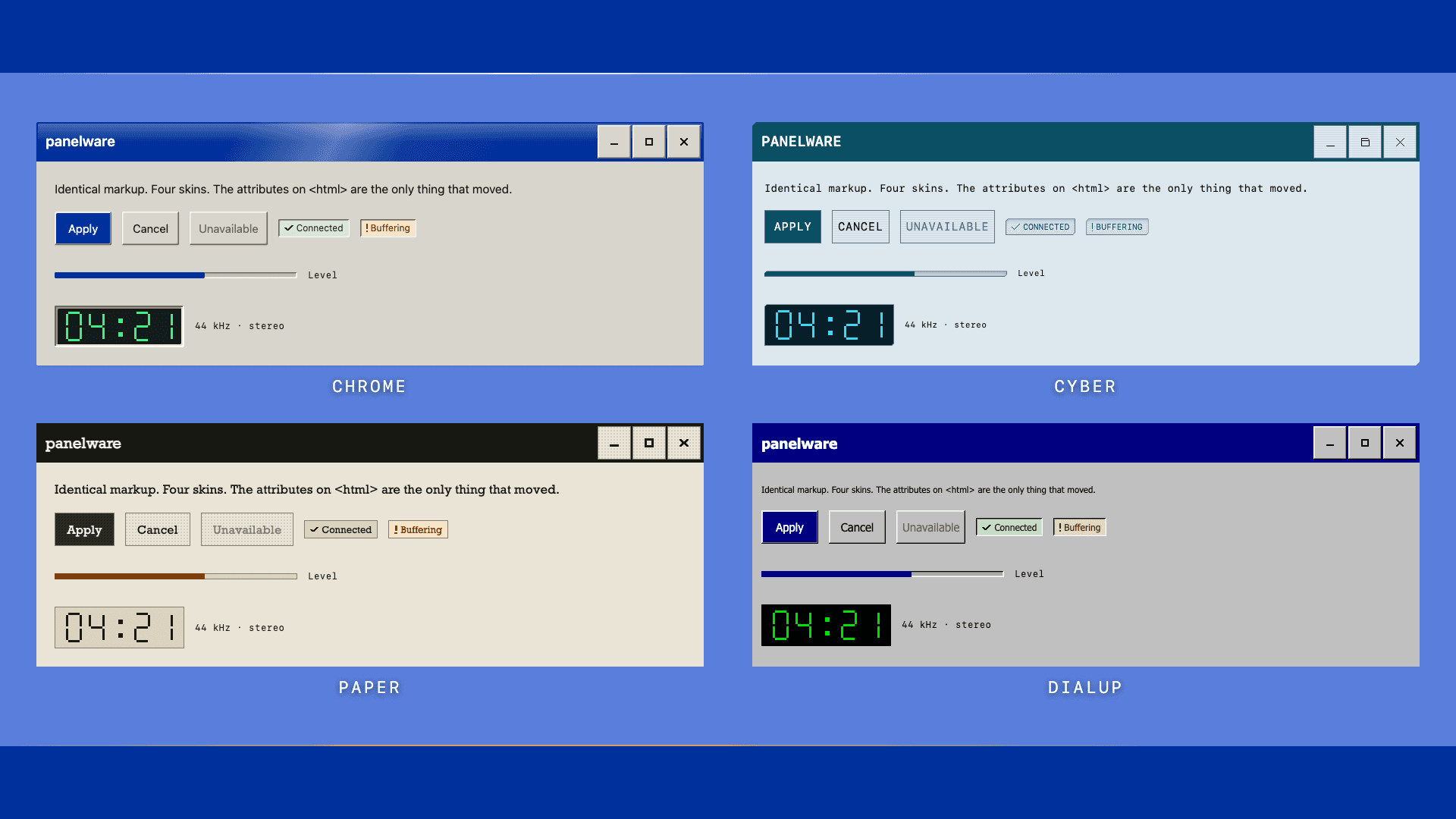
A skin that changes all of its colour and none of its rhythm reads as the same design twice. So each one also changes type, padding, gaps, timing, corner geometry, and what carries elevation. Paper has no shadows. Its depth is a dithered screen.
Skin, theme, and density are three separate attributes, and they work on any element. A dark toolbar inside a light page is one data-theme away.
No skin moves the 44px touch target. The compact density goes to 32px, and that is a choice the consumer makes, not the skin.
The radio is the one round thing in the kit. The shape tells you a control is choose-one before you have read a word, so the convention stays even where it breaks the look.
05 · The equaliser is ten sliders
The obvious build is one slider with ten thumbs. Radix has one. Give it three thumbs at 20, 60, and 40, drive the middle one up, and it returns 20, 40, and 100.
It re-sorted. A multi-thumb slider is a range, and its thumbs are ordered. The thumb you are holding now sits at a different index, and the focused element reports the value of a band nobody touched.
For a price filter that is correct. For an equaliser it is a bug with no fix, because 3kHz is always 3kHz and dragging it up must never turn it into 6kHz.
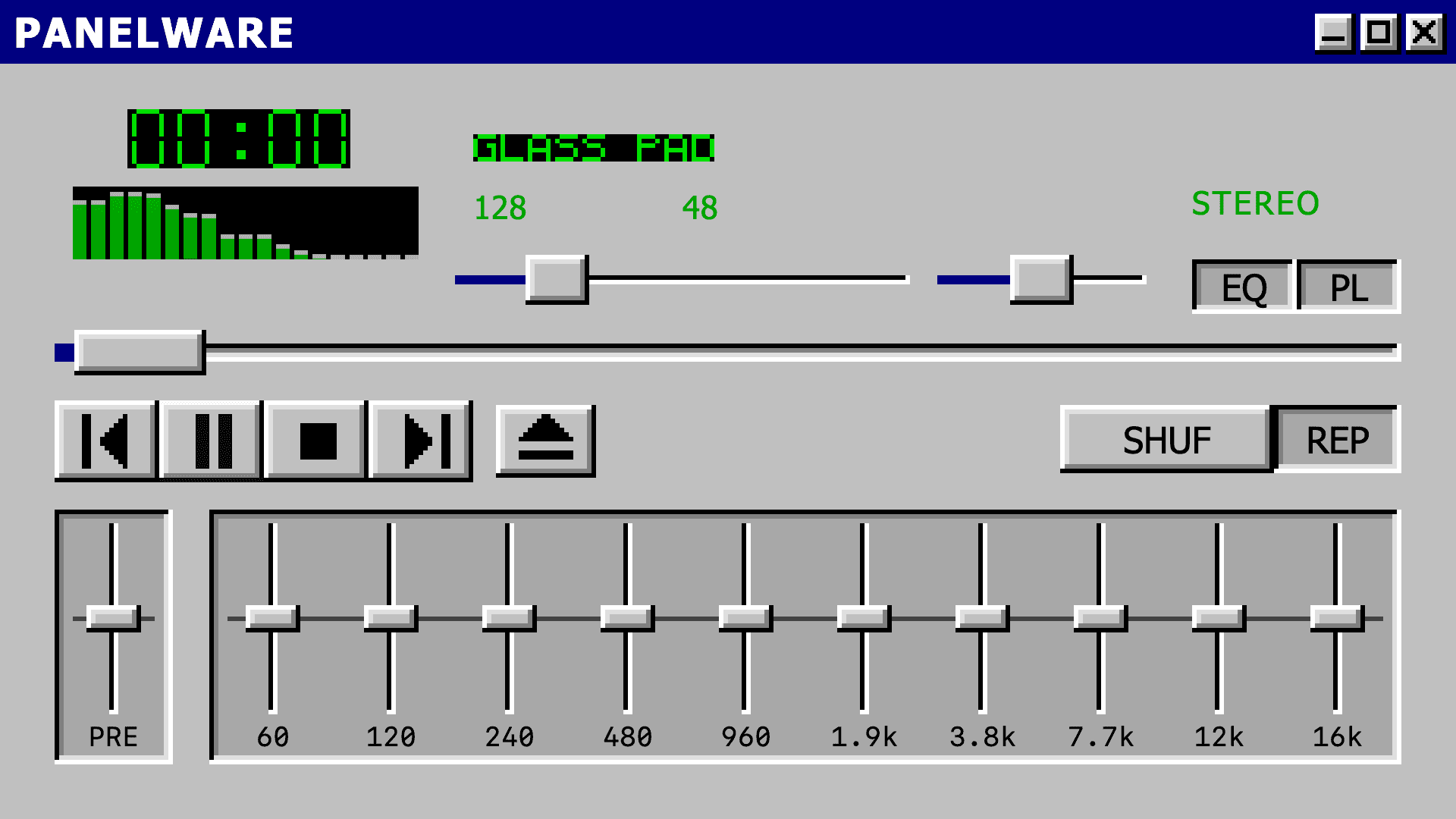
So the bands are separate sliders that share a scale, a zero line, and a frame. Each keeps its own name and value.
That has two costs, and the docs name both. Ten bands are ten tab stops. And on touch, a vertical slider takes vertical drags, which is also how a page scrolls, so the equaliser stays narrow with page to scroll on either side.
06 · Contrast is checked in CI
The palette does not claim to be accessible. taste-check, a tool I wrote, reads every token file and measures every pairing on every build. The repo also keeps a fixture whose only job is to fail, so a silent gate gets noticed.
the floor for a bevel's frame, because the frame is what says where a control ends
The white highlight inside a bevel is left out of the check. It measures 1.47:1 on a silver face and marks no edge by itself, and pushing it to 3:1 would turn it grey.
That exception is written down next to the token it applies to, and every ratio in the token comments comes from the same parser the build runs.