
Skip to content
homeworkplayaboutcontact
resume
homeworkplayaboutcontact

This is a footer (ew stinky...)
work about contact flowerboxes linkedin x
josue:~$ Josué Avalos Jiménez · Designer · Prev. @ Nintendo · Open to work © 2026 · built from scratch · press

This is a footer (ew stinky...)
work about contact flowerboxes
@1kind.px @josueava.los linkedin x
Josué Avalos Jiménez · Designer · Prev. @ Nintendo · Open to work © 2026 · built from scratch

Voxel Display

Project Typeface + Icon Design

Year 2024

Type
Type DesignGraphic DesignPixels

Overview

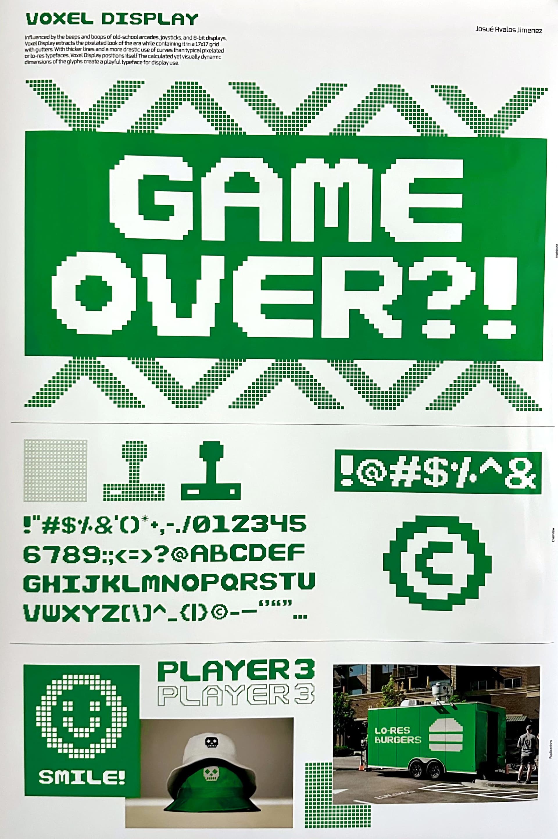
Influenced by the beeps and boops of old-school arcades, joysticks, and 8-bit displays, Voxel Display extracts the pixelated look of the era while containing it in a 17x17 grid with gutters. With thicker lines and a more drastic use of curves than typical pixelated or lo-res typefaces, Voxel Display positions itself as a functional yet fun option. The calculated yet visually dynamic dimensions of the glyphs create a playful typeface for display use.


Seven A’s

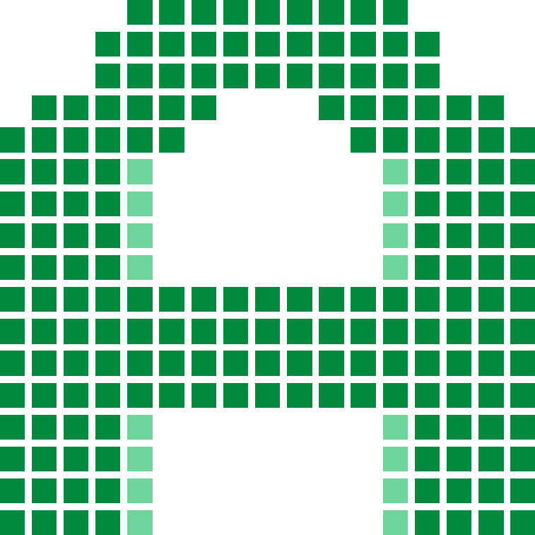
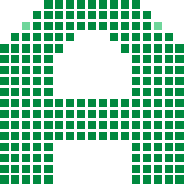
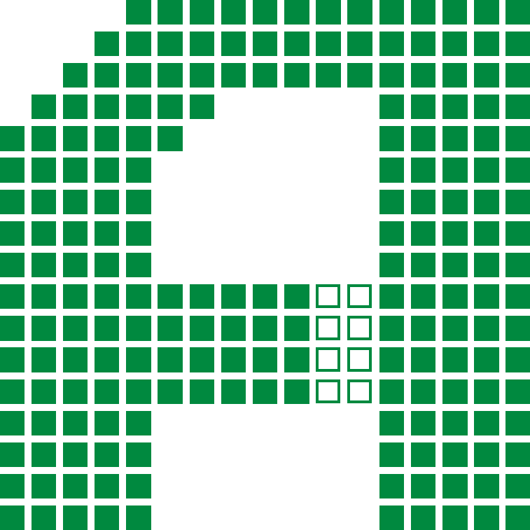
The A came before the rest of the set. Nothing else could be drawn until it settled what kind of face this was, so it took seven passes on the same 17x17 grid.

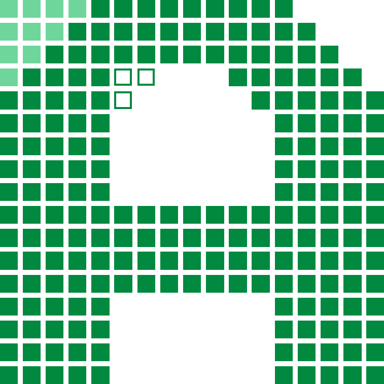
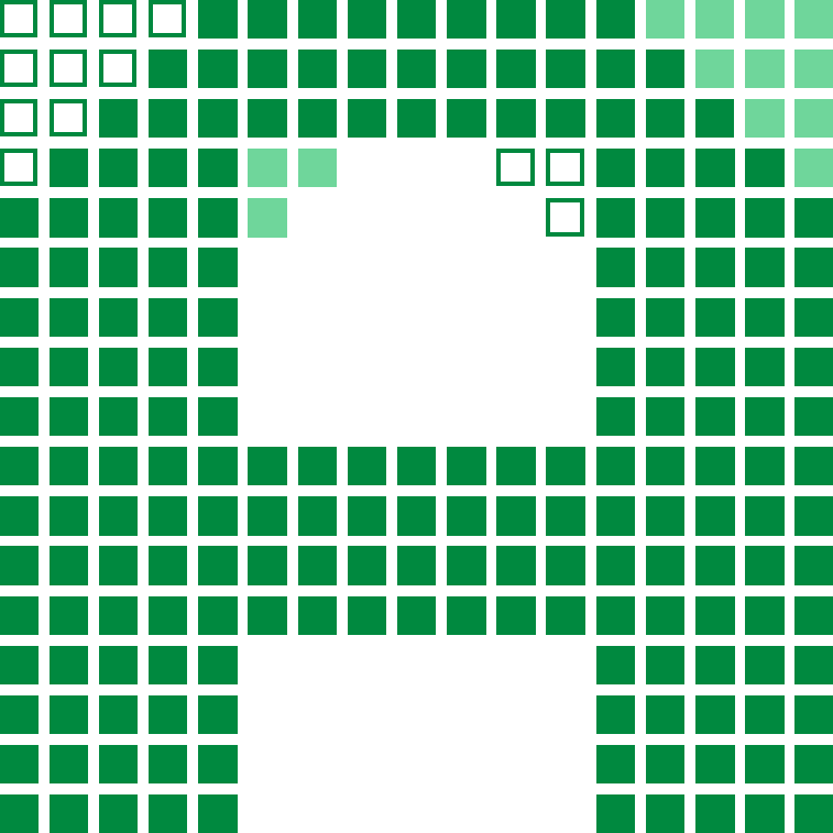
The first four stay symmetric and argue about weight. The apex loses a cell at each end, both stems go from four cells wide to five, and the shoulder steps out to nine, eleven, thirteen. Then the fifth runs the left arm flush to the edge of the square, the sixth is that same move mirrored to the right, and the seventh cuts a notch through the crossbar.

None of those last three made it into the font. The question underneath all of it was whether this would read as a techy pixel face or a fun one, and a flush edge is the straightest the letter ever gets. The set went back to the symmetric drawing and spent the rest of the alphabet leaning further into intentionally awkward curves.
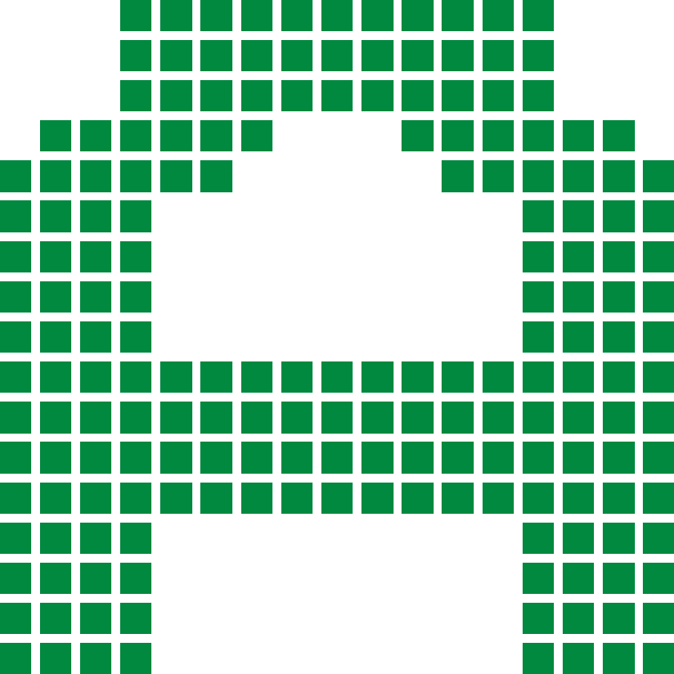
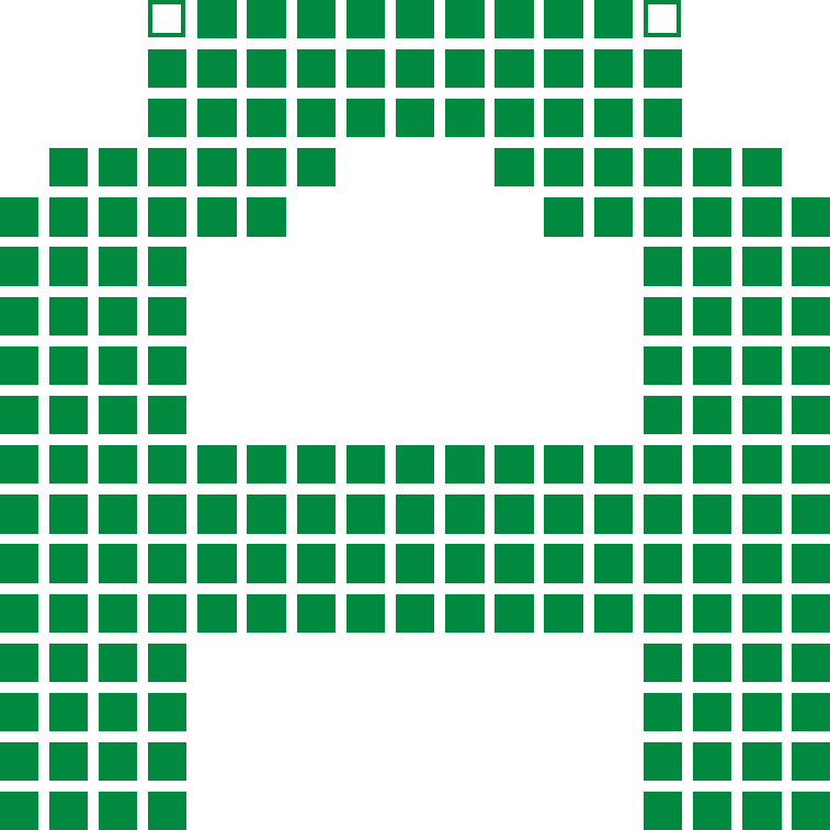
Each pass is marked against the one before it: a filled pale cell arrived, an open one left. The first has nothing to compare against, and the last three are the ones that lost.
version one, the baseline, symmetric with a flat eleven-cell slab across the top and nothing marked
01
version two, the two cells that left marked hollow at either end of the top slab
02
version three, sixteen pale cells arriving down both stems as they thicken from four cells to five
03
version four, two pale cells arriving to step the shoulder out to thirteen
04
version five, ten pale cells arriving as the left arm runs flush to the edge, and three hollow where the counter wall moved
05 cut
version six, thirteen hollow cells down the left and thirteen pale ones up the right, the same move mirrored
06 cut
version seven, eight hollow cells cutting a notch through the crossbar
07 cut

Specimen

GAME OVER

9/24
Lettersunicase: lowercase maps to the same forms
ABCDEFGHIJKLMNOPQRSTUVWXYZ
Numerals
0123456789
Punctuation
!"#$%&'()*+,-./:;<=>?@[\]^_{|}
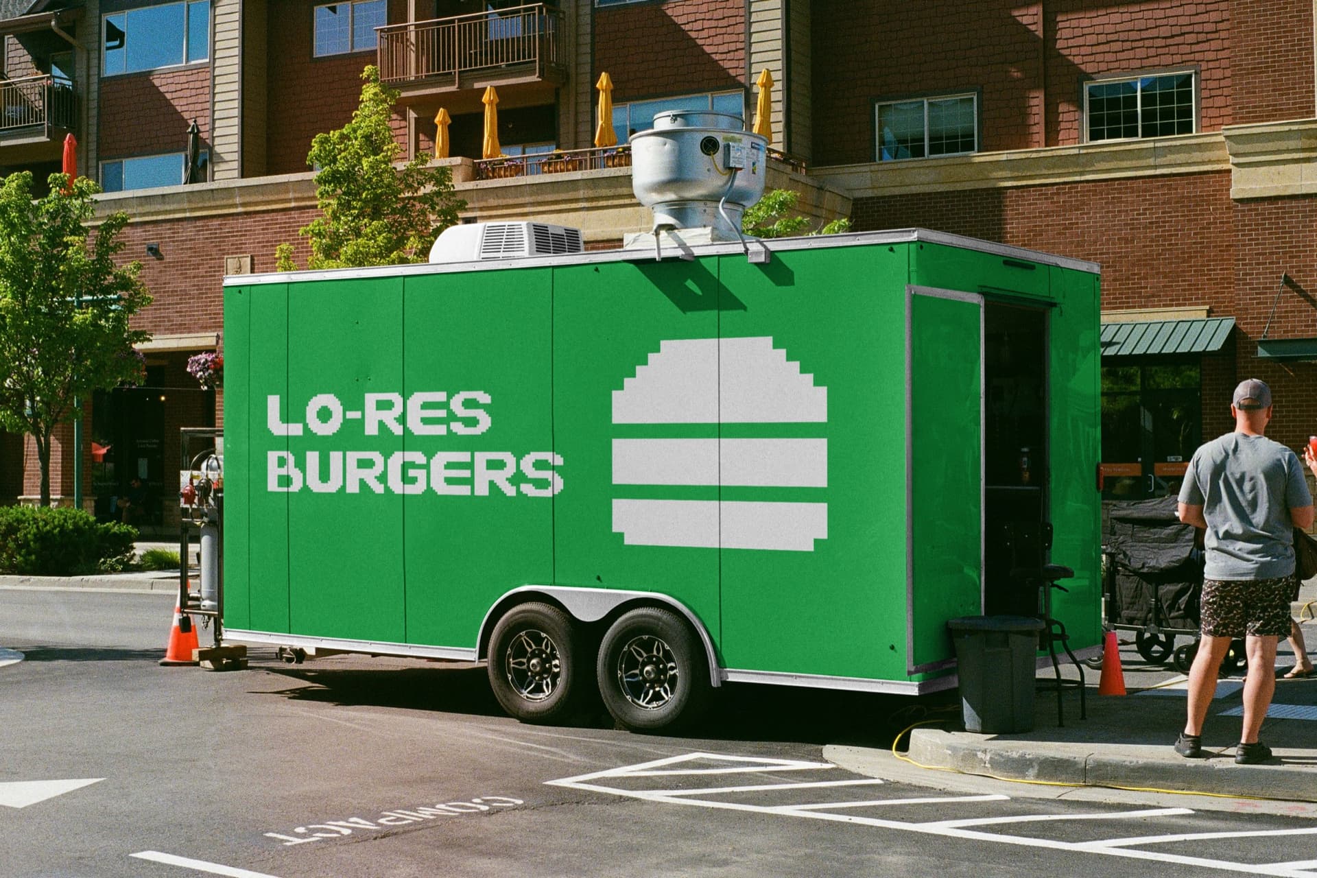
food trailer mockup wrapped in green with the Lo-Res Burgers wordmark and a pixel burger icon, parked on a city street
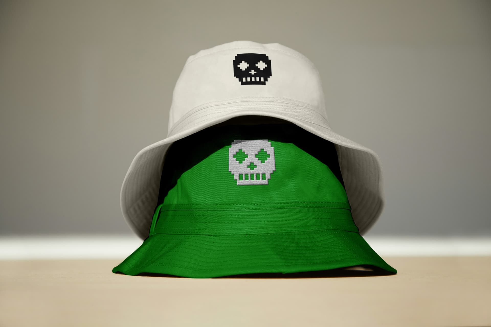
white and green bucket hat mockups, each embroidered with a pixel skull mark
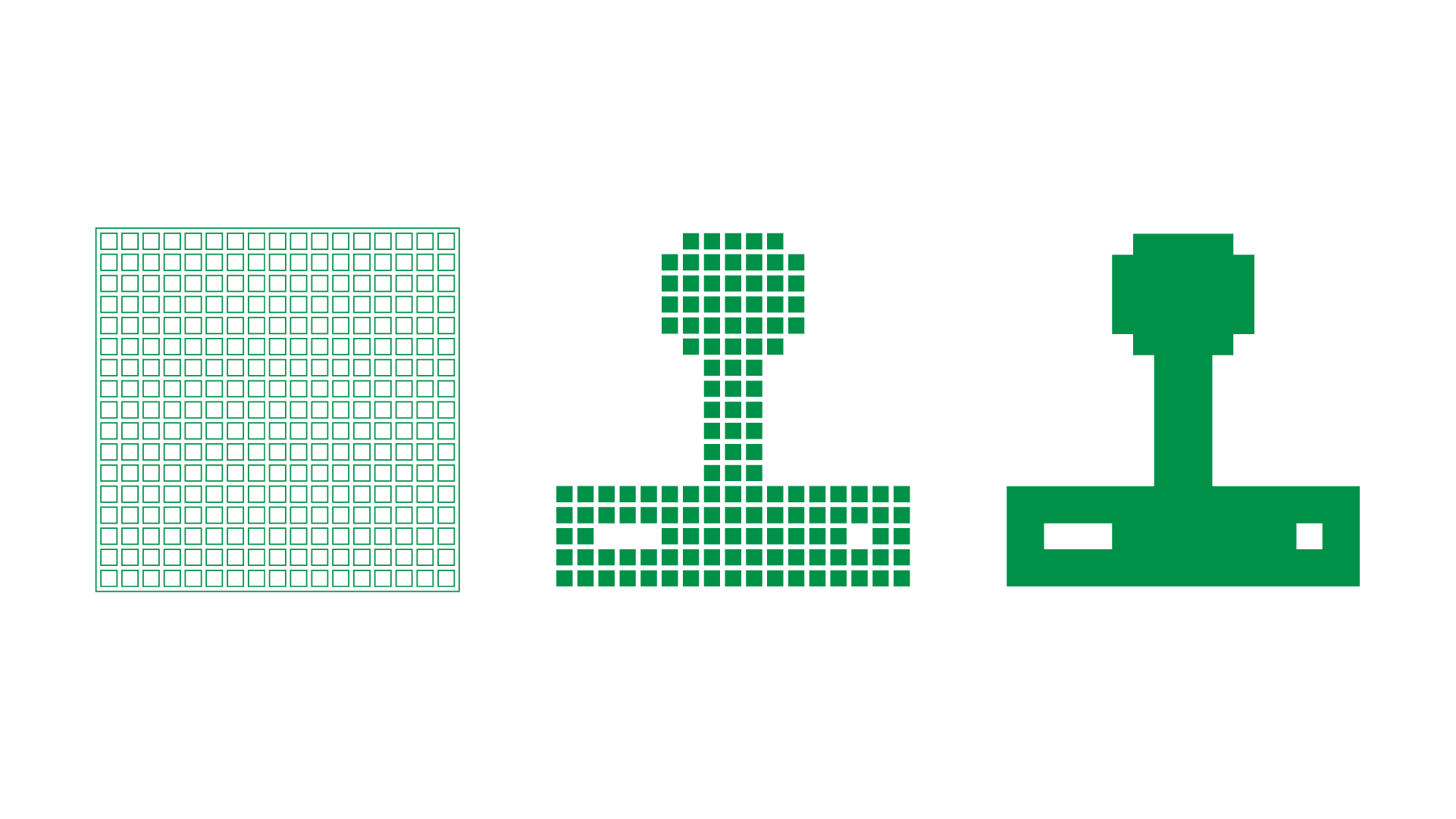
joystick icon variations
printed Voxel Display specimen poster on a wall, headlined Game Over?! with the full glyph set, joystick icon, punctuation marks, and the Lo-Res Burgers bucket hat and food trailer mockups
The specimen as a printed poster. The green here is the ink, pulled back to the screen green it is meant to be, because the two do not meet: process printing cannot reach it

Mitosis DiagramsCreative Media @ NC State Football

all work