
TRYDENT
Typography and Technology
2023
Overview
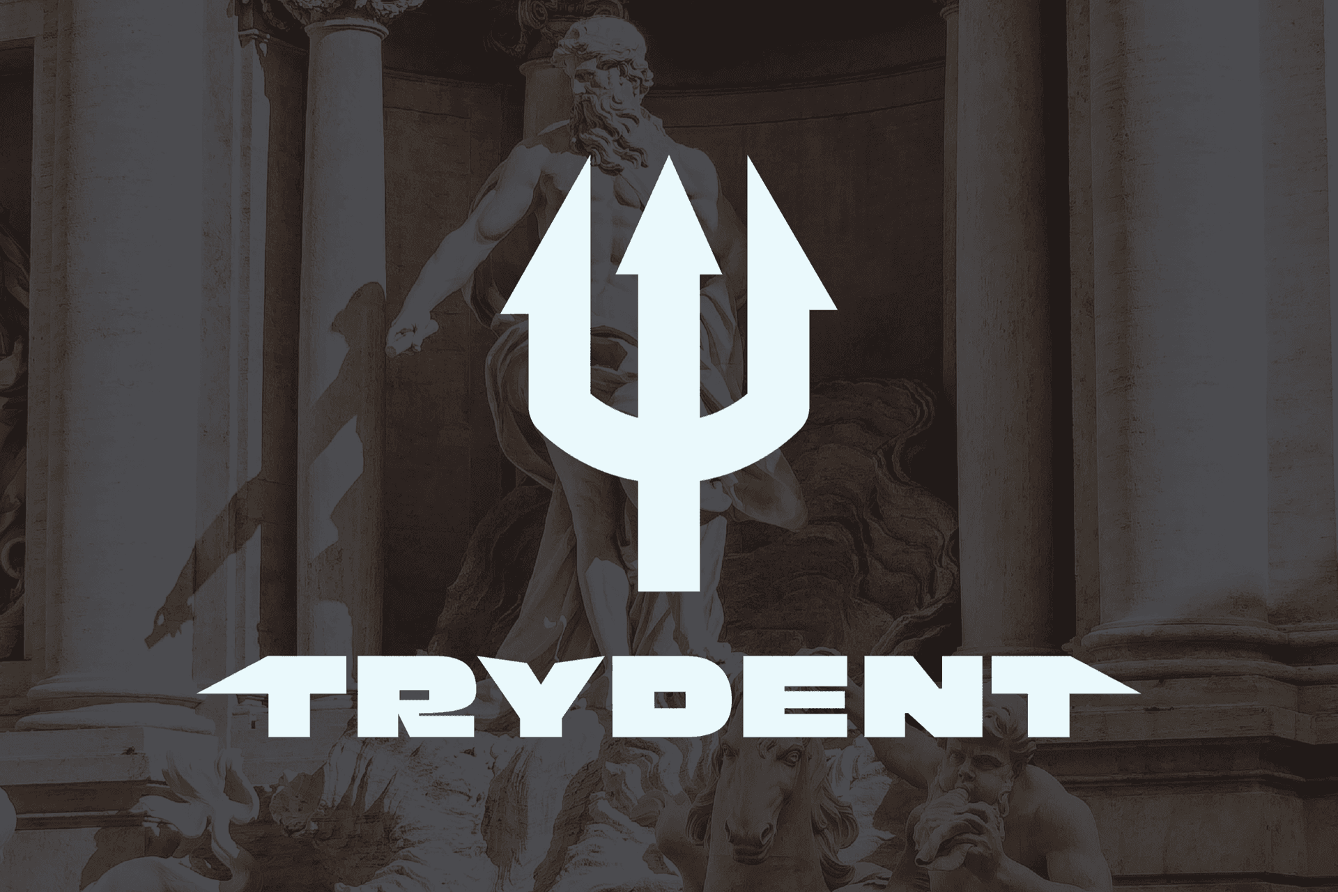
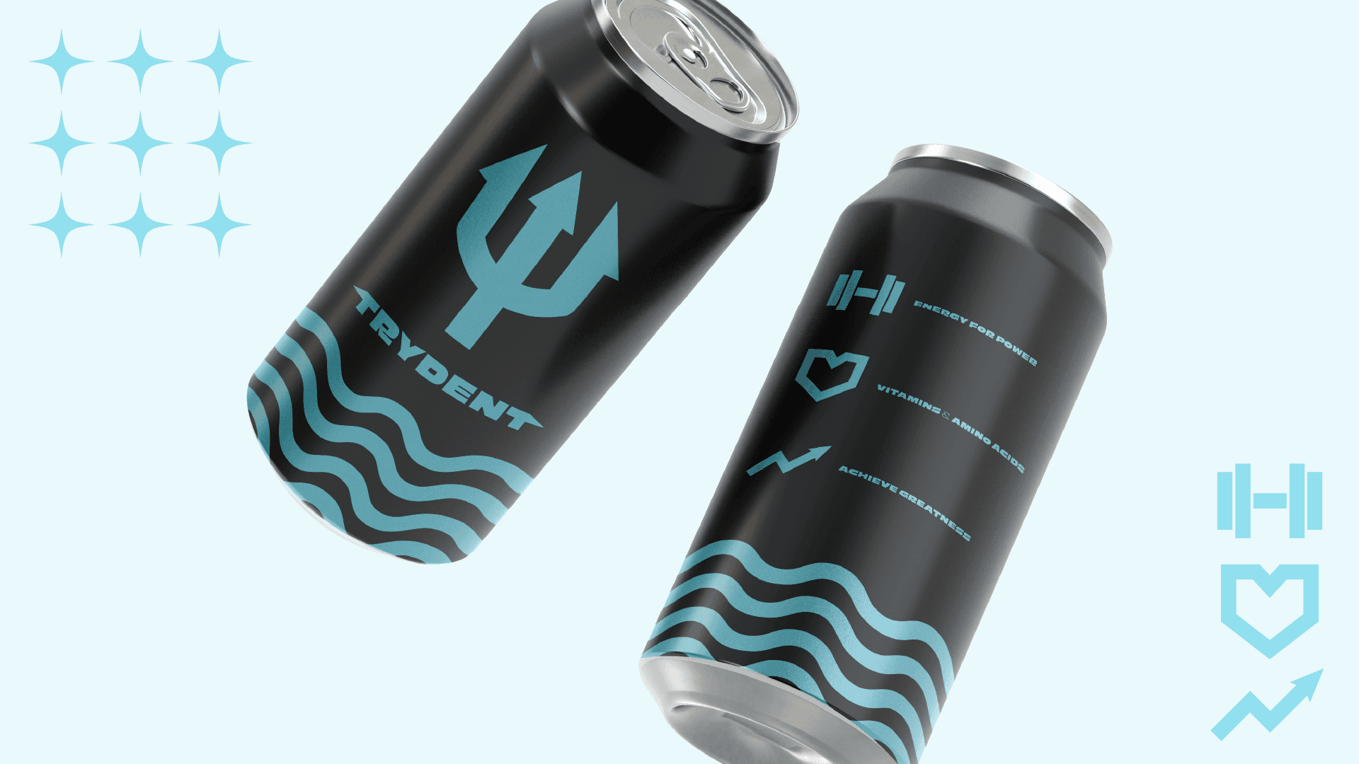
An energy drink concept for people chasing perfection and reaching for Olympus. TRYDENT Energy is a radical yet accessible source of energy and vitalization aimed primarily at bodybuilders, powerlifters, and athletes.
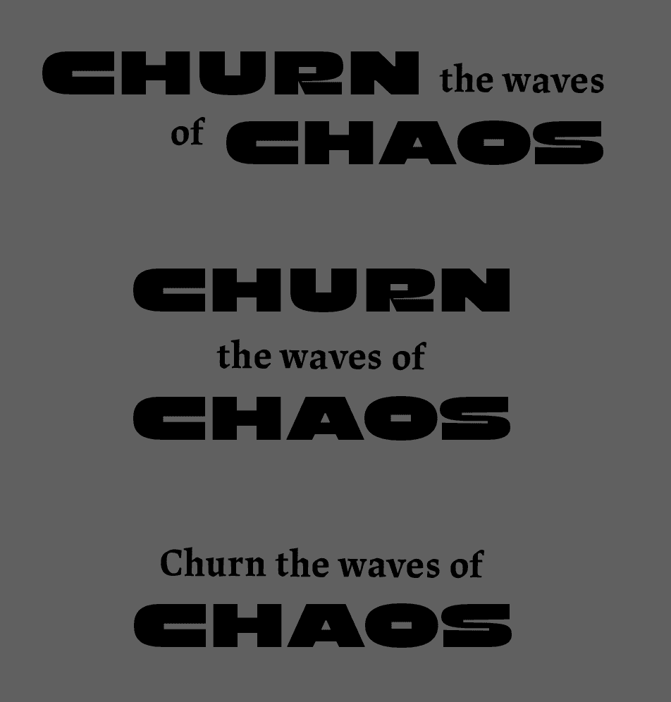
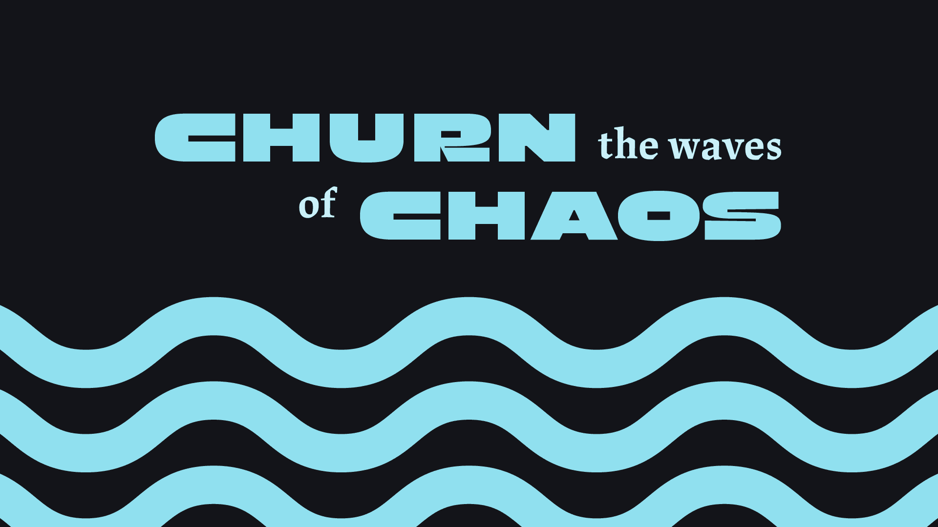
I took inspiration from Greek mythology and current energy beverage trends in the market to develop the branding and visual identity of the company and product. Everything from the typography selection and customization to the primary mark was carefully curated to fit a tasteful blend of modern and ancient (if that even makes any sense). Even the tagline, "Churn the Waves of Chaos," is loosely based on an excerpt about Poseidon from Homer’s famous epic, The Odyssey.
Process Work
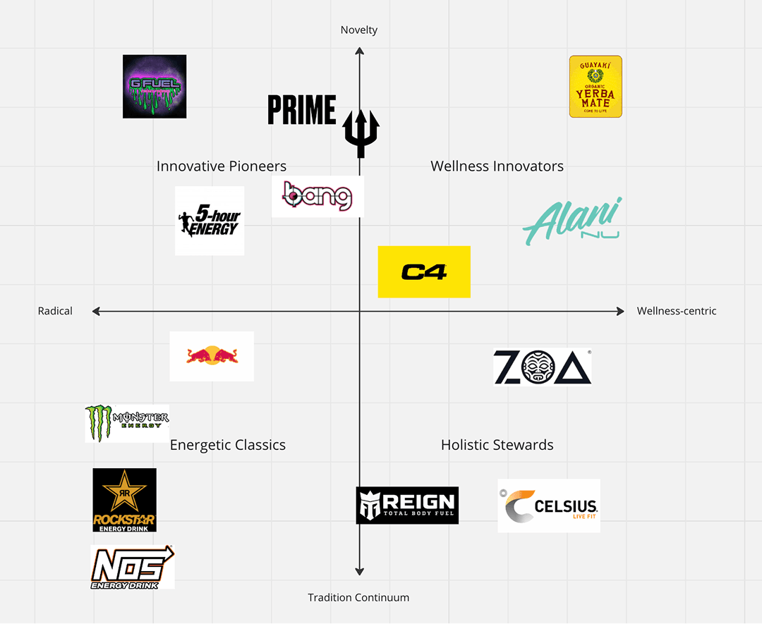
I wanted TRYDENT to be equally focused on its “healthy” appeal (the inclusions of vitamins, protein, and creatine that would help “muscle growth”) and radical appeal (selling a lifestyle or general perception of yourself, one of glory and power). However, I wanted my drink to deviate more from the traditional forms and branding of energy drinks, sort of the antiquated brands (some that are iconic and some that have fallen out of relevance). Not just in its branding, but in its design entirely, I wanted it to feel like something new in an oversaturated market while still not alienating potential consumers that just want some energy.
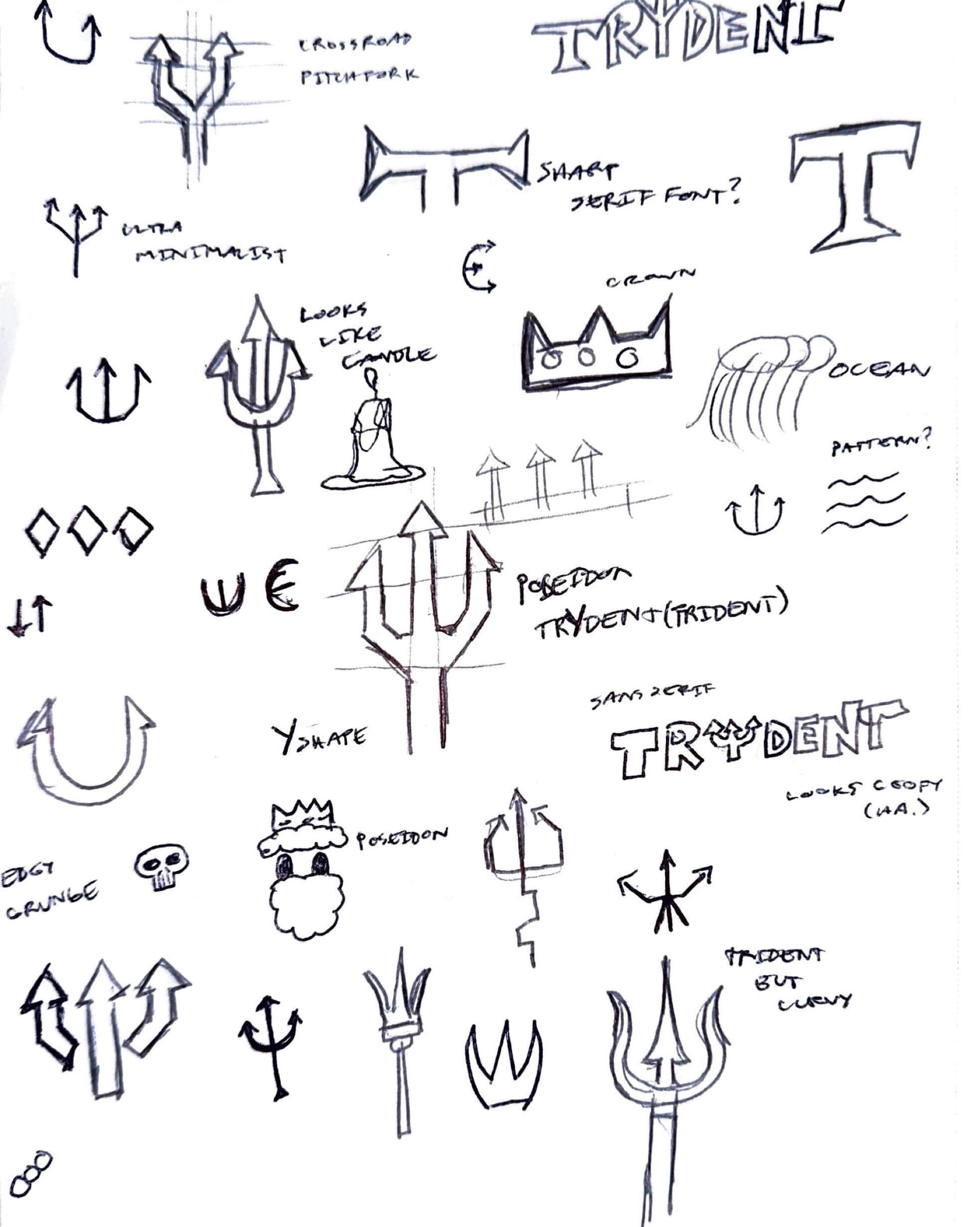
Before any of that, a page of trying to find the thing. Most of it is the trident under different excuses: a crossroad pitchfork, an ultra minimalist one, a crown, a Y shape, ocean lines, Poseidon himself. The notes are where the decisions are, and two of them are rejections written at the moment they happened, a candle drawn next to the mark it was starting to resemble, and a wordmark set in a sans marked “looks creepy (ha.)”.
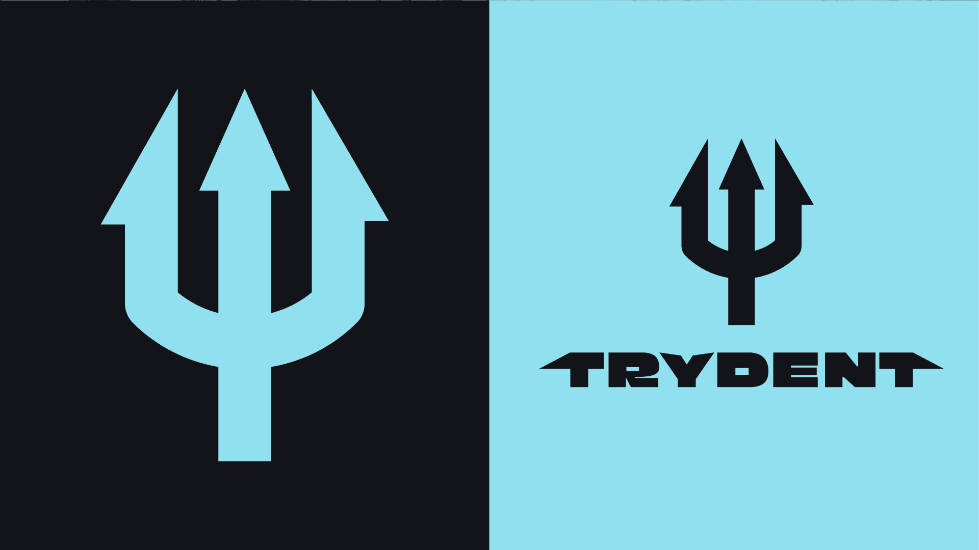
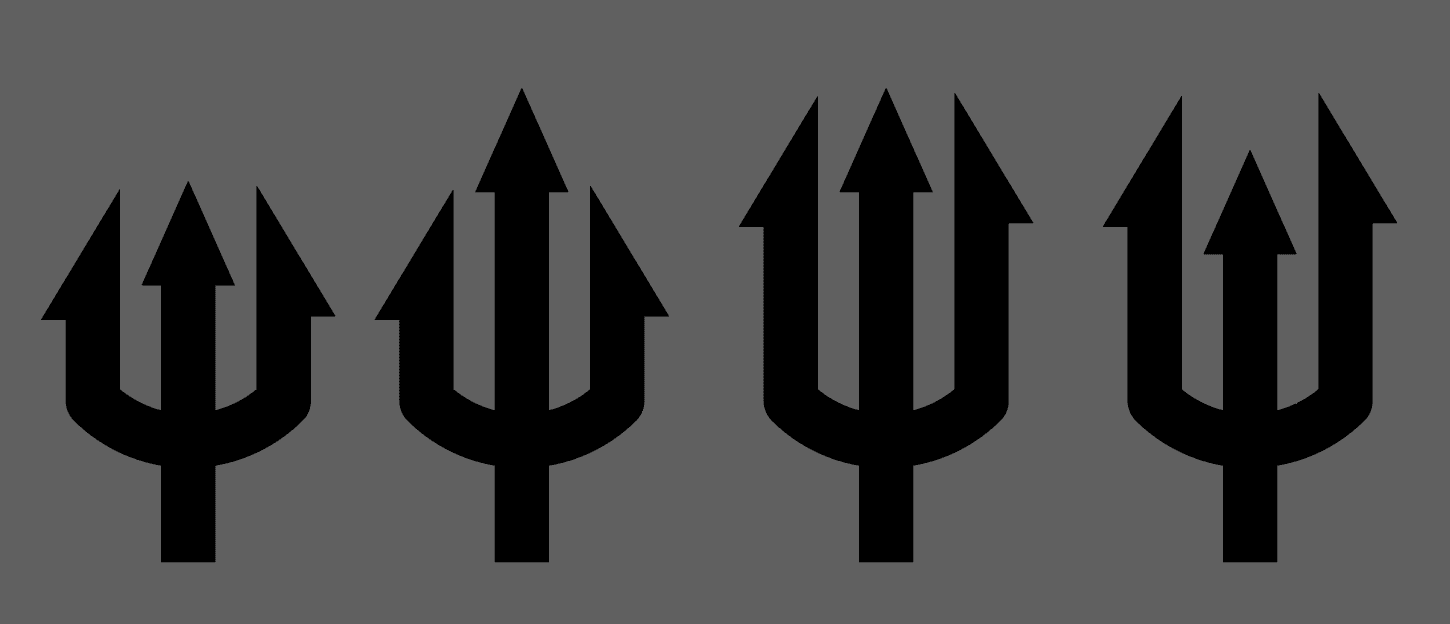
Then the mark itself, four passes, moving the outer tines and the centre prong against each other until the proportion sat right.
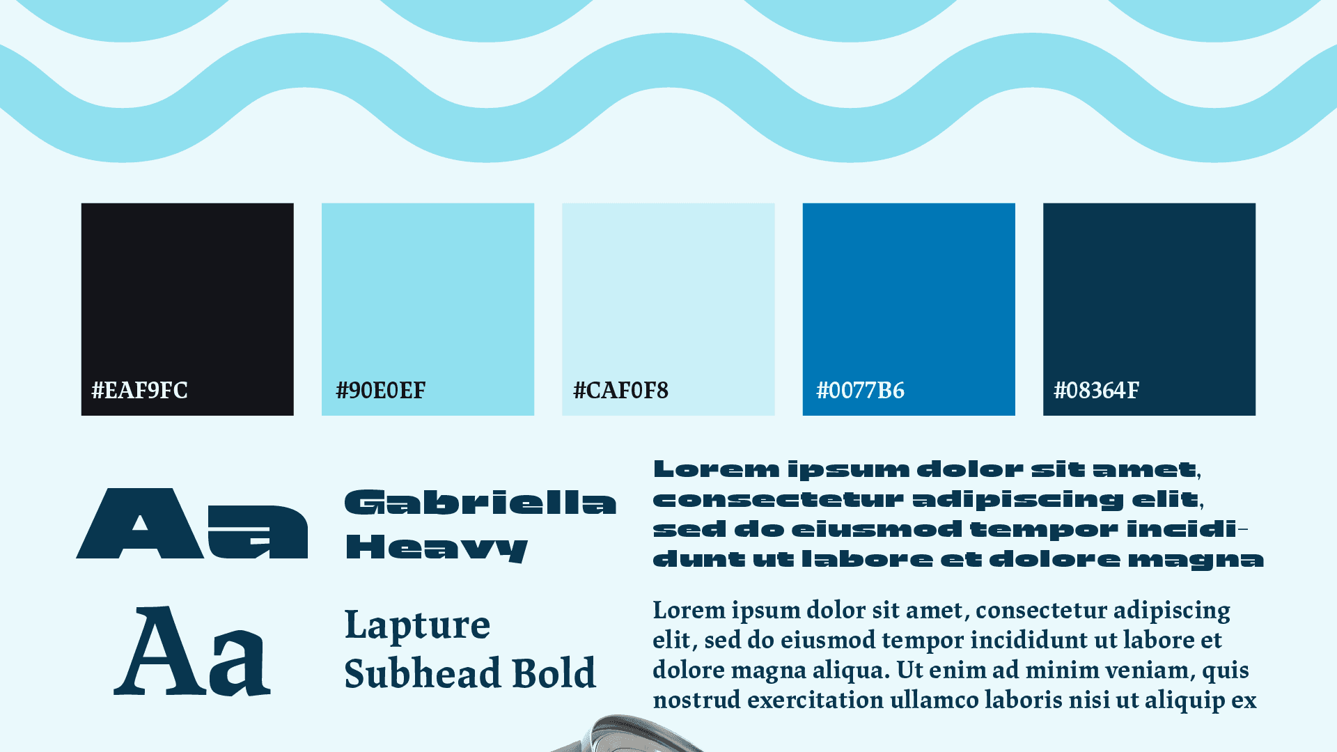
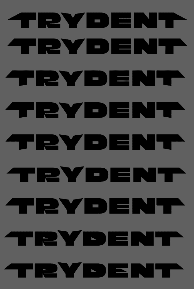
The wordmark for TRYDENT is an alteration of the word using “Gabriella Heavy” font. I stretched the edges of the T’s to make them appear sharper and edgier. I adjusted the Y to look more like a sharp weapon, like a duo-ident (ha.). I also moved the counters for personal preference.
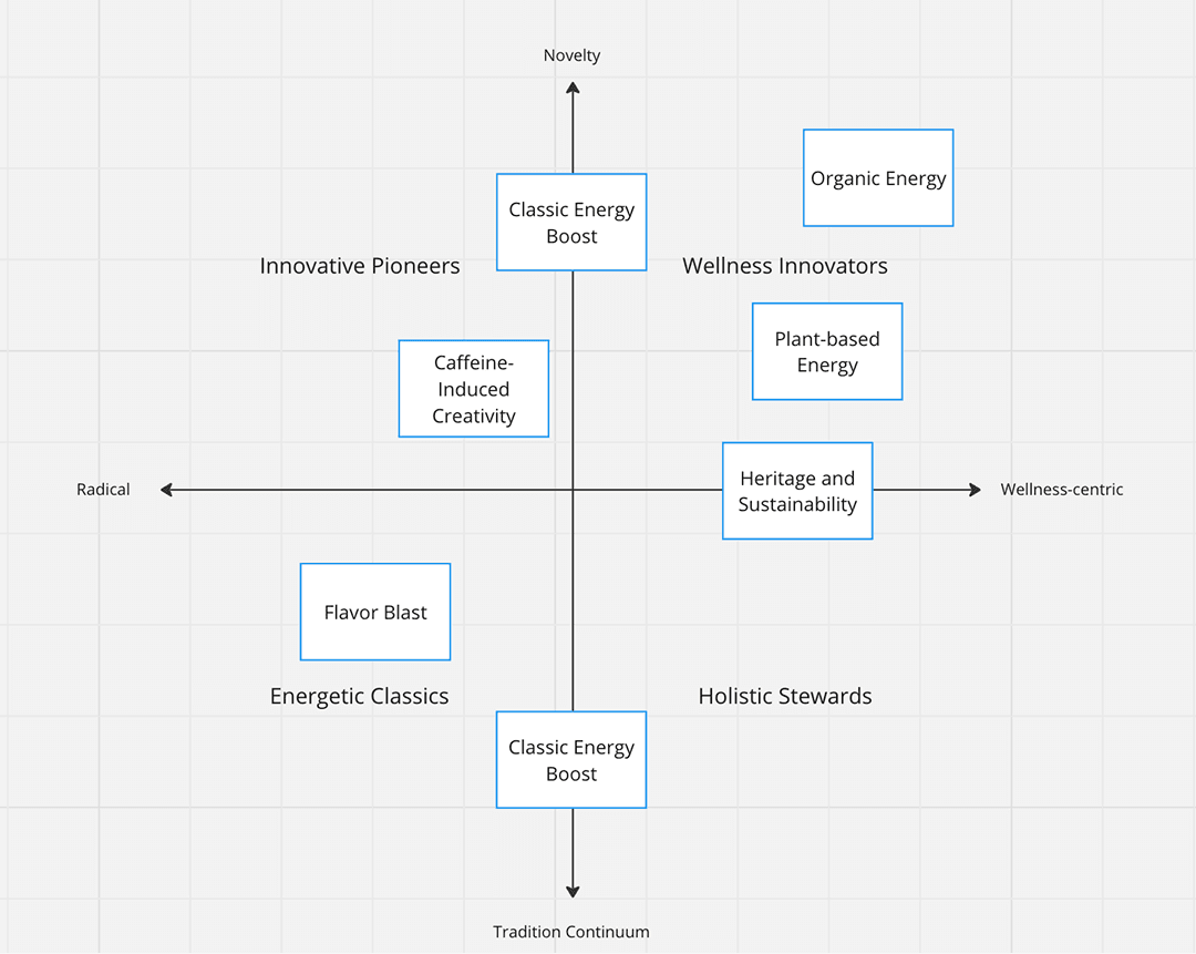
This was a typography class, so we ran typesetting exercises on the faces we picked: name every part, and be able to say why you chose it.
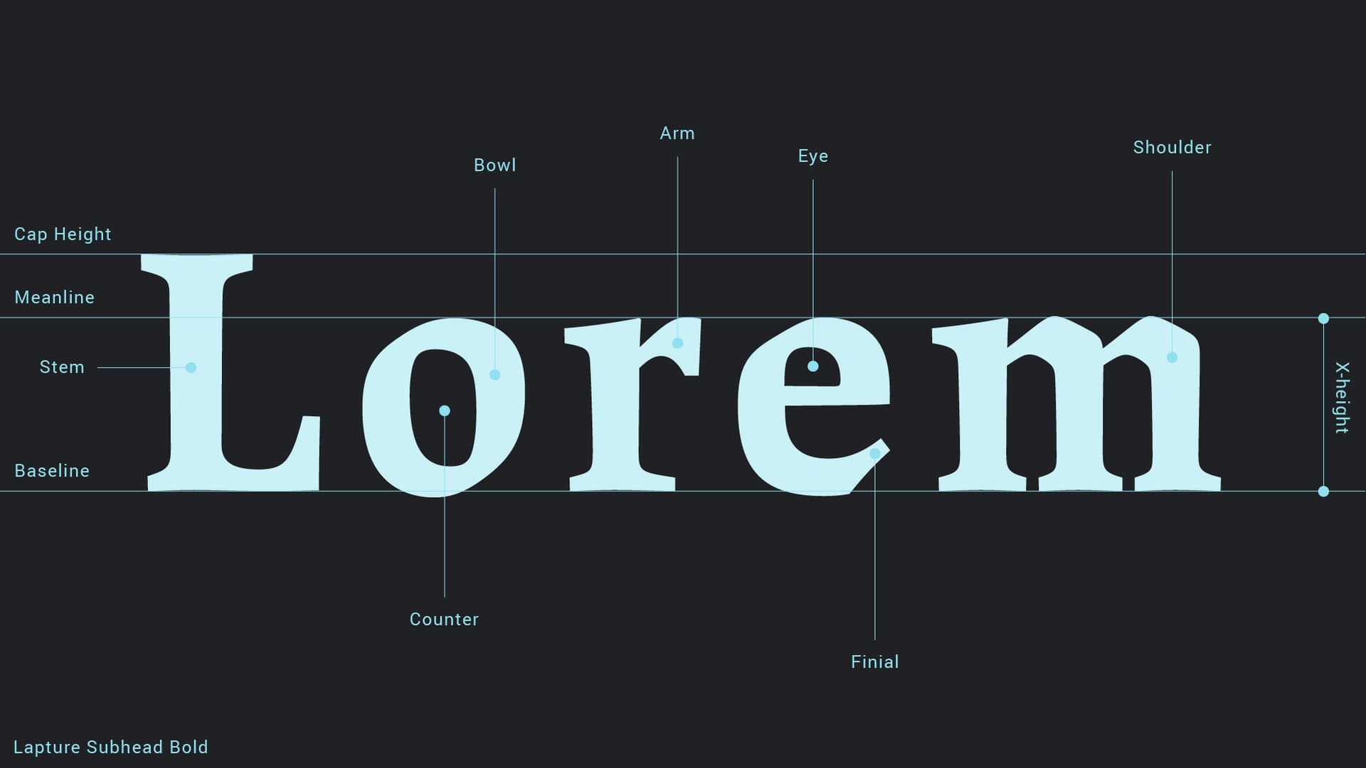
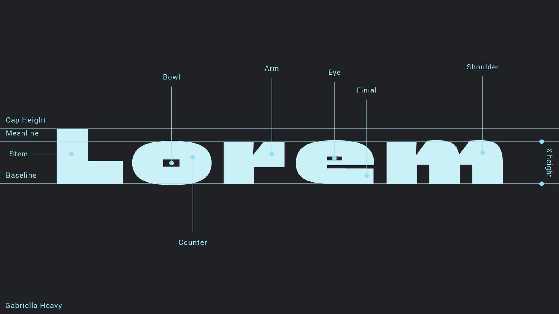
Both faces then had to hold a line together. Three arrangements of the same eight words, moving where the break falls and how much size separates the two.