Skip to content
homeworkplayaboutcontact
resume
homeworkplayaboutcontact

This is a footer (ew stinky...)
work about contact flowerboxes linkedin x
josue:~$ Josué Avalos Jiménez · Designer · Prev. @ Nintendo · Open to work © 2026 · built from scratch · press

This is a footer (ew stinky...)
work about contact flowerboxes
@1kind.px @josueava.los linkedin x
Josué Avalos Jiménez · Designer · Prev. @ Nintendo · Open to work © 2026 · built from scratch
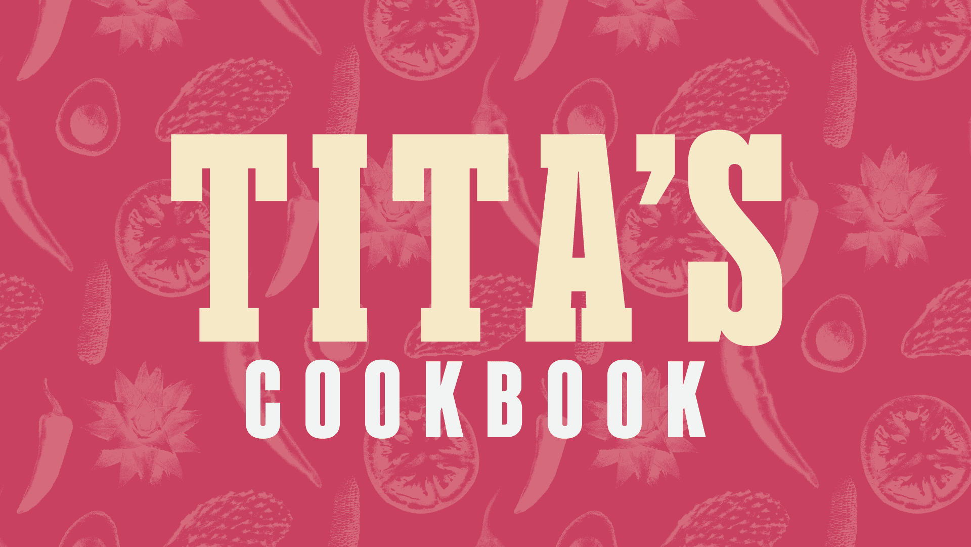
Title slide for Tita's Cookbook, with bold cream and white lettering over a dark pink illustrated pattern of chiles, tomato slices, and nopales

Tita's Cookbook

Class Typography and Technology

Year 2023

Type
Graphic Design

Overview

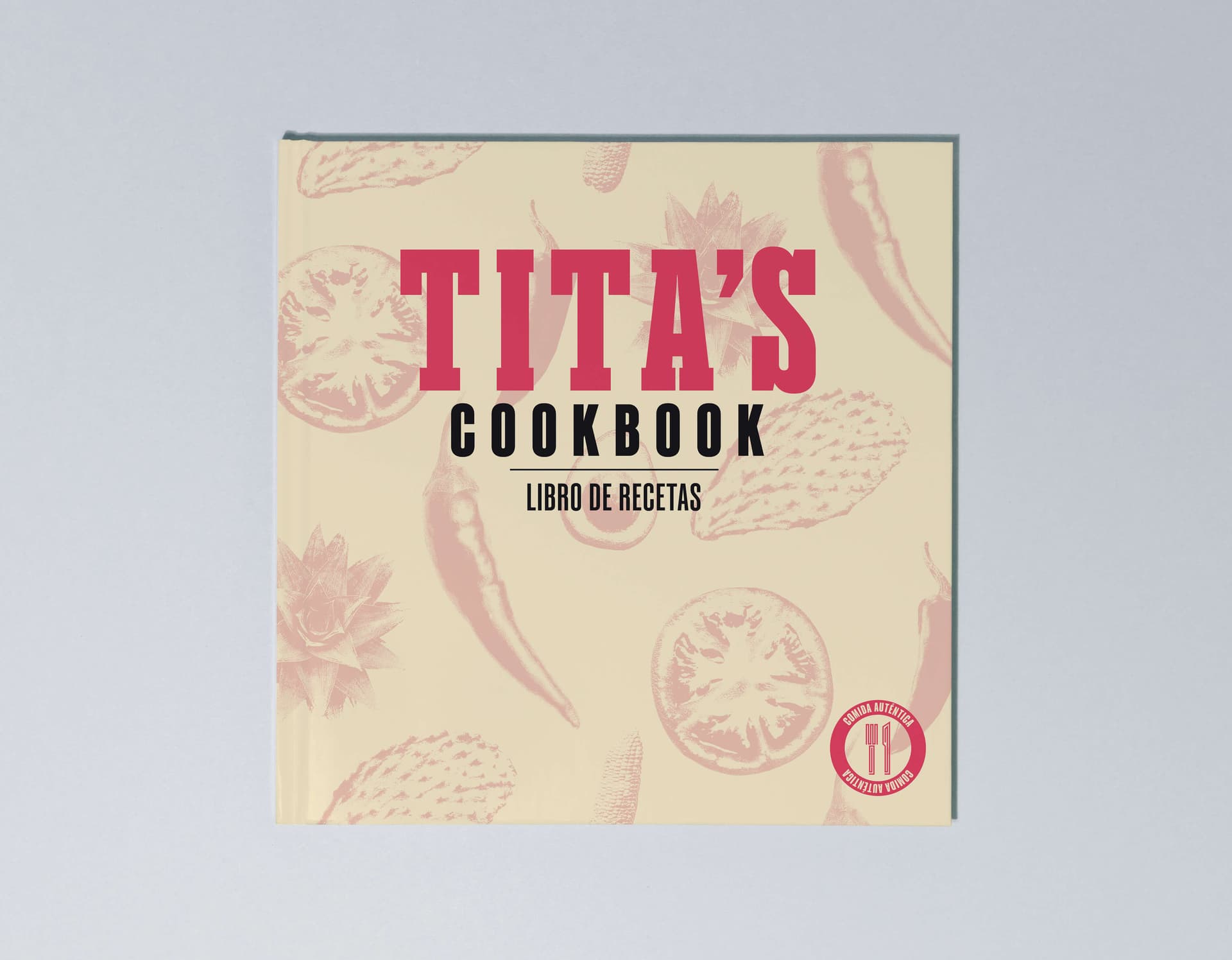
A deeply personal project, I undertook the design of a conceptual cookbook based on my grandmother’s (Tita, as my family calls her) cookbook. I imagined it as if it would be sold in bookshelves in the US. The result was a blend of my grandma's personality and quirks with my artistic style, a memento of our relationship, and my love for her authentic Mexican food.

The images chosen depict common ingredients used by Tita in her cooking and some of my favorite dishes. The icons are inspired by ancient Aztec art, such as carvings and murals, with a type of line work commonly seen in México.
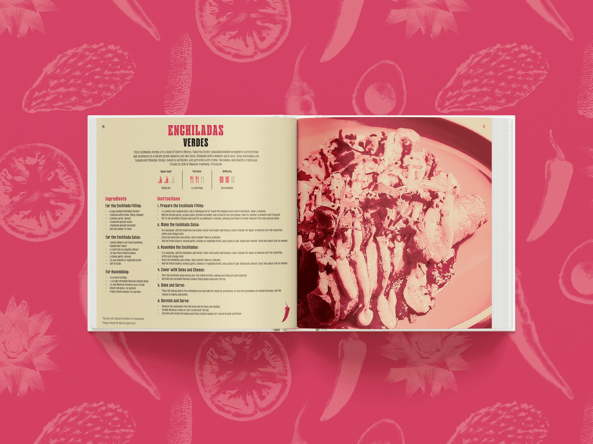
Two-page spread of the Enchiladas Verdes recipe from Tita's Cookbook, with ingredients and numbered instructions on the left page and a full-bleed photo of the finished dish on the right
Hardcover mockup of Tita's Cookbook, cream cover with pink and black "Tita's Cookbook / Libro de Recetas" lettering over an illustrated pattern of chiles, tomatoes, and nopales, with a red "comida auténtica" seal in the corner
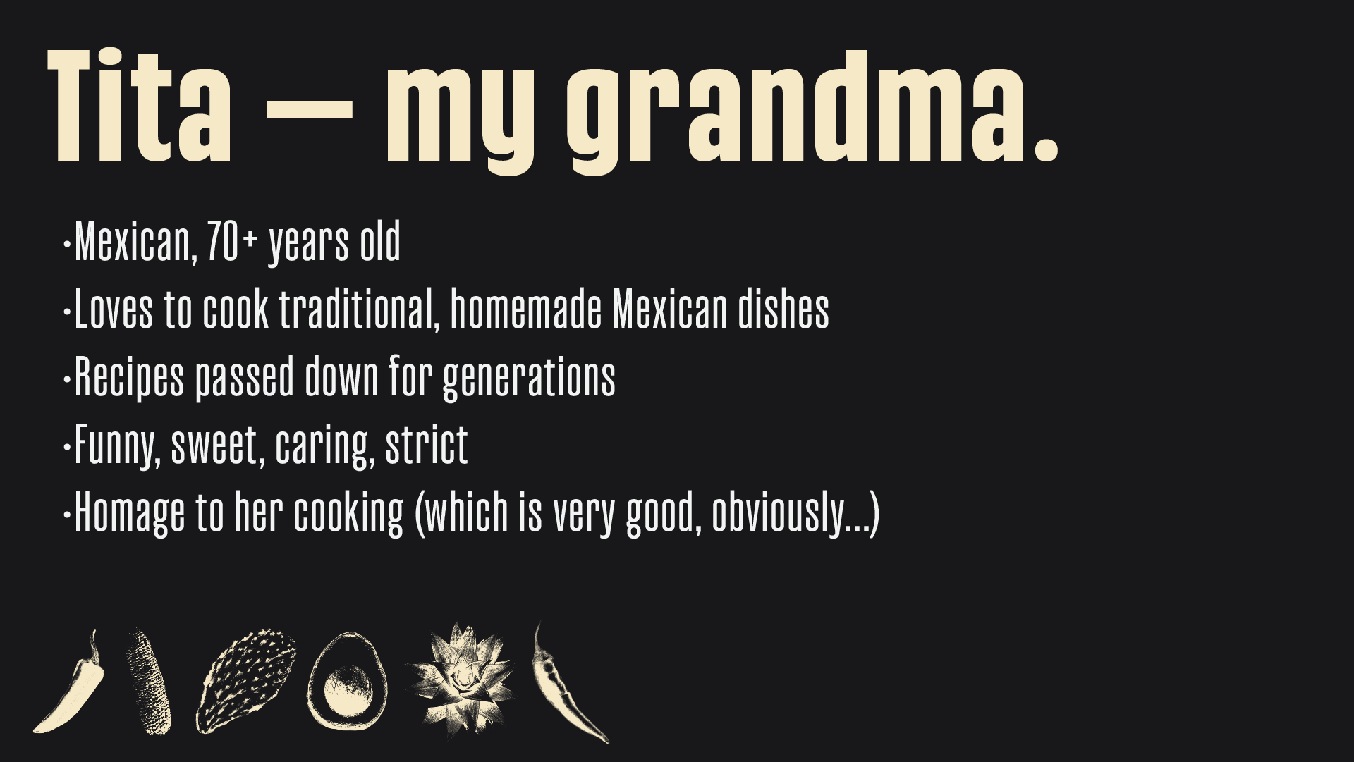
Slide reading "Tita — my grandma" with bullet points describing her as Mexican, 70+ years old, a home cook whose recipes were passed down for generations, and funny, sweet, caring, and strict, over a row of small ingredient icons
Repeating illustrated pattern of chile peppers, tomato slices, avocado halves, ears of corn, and nopal cactus paddles in pink line art on a cream ground
Chile de árbol
Cubiertos
Comal

Reflection

I updated this project slightly for when I showed off my favorite projects on my capstone. I refreshed the image used in the recipe spread to be more stylistic, I felt like it was an afterthought in my first iteration. When I got to revisit these files, though, I was very emotional and proud. This project may not be a fancy design system or a really in-depth case study, but it tells a story about who I am and how proud I am of where I come from.

I don’t often get to represent my family or my story through my design work, I want to find more ways of doing this. It’s a good reminder that I come from somewhere and it still helps define who I can be.

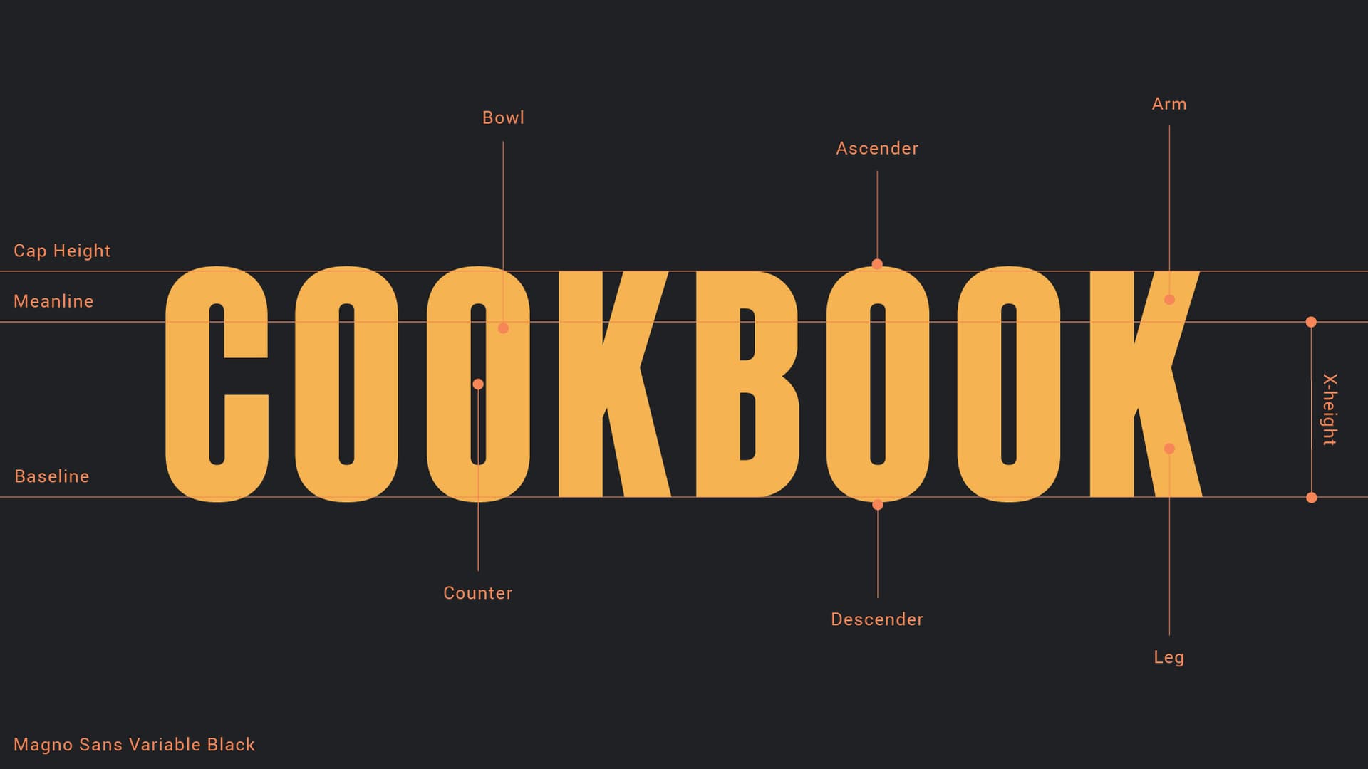
This was a typography class, so we ran typesetting exercises on the faces we picked: name every part, and be able to say why you chose it.
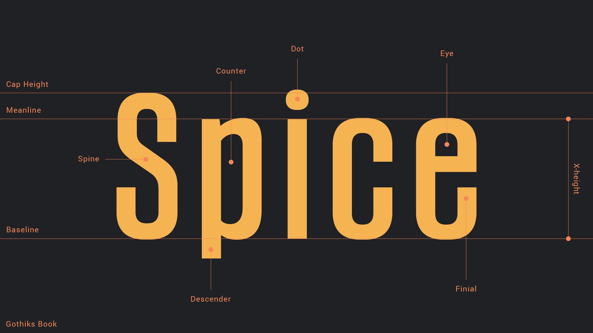
Anatomy diagram of Gothiks Book set as “Spice”, labelling cap height, meanline, baseline, x-height, spine, counter, dot, eye, descender and finial
Gothiks Book
Anatomy diagram of Magno Sans Variable Black set as “COOKBOOK”, labelling bowl, ascender, arm, counter, descender and leg
Magno Sans Variable Black
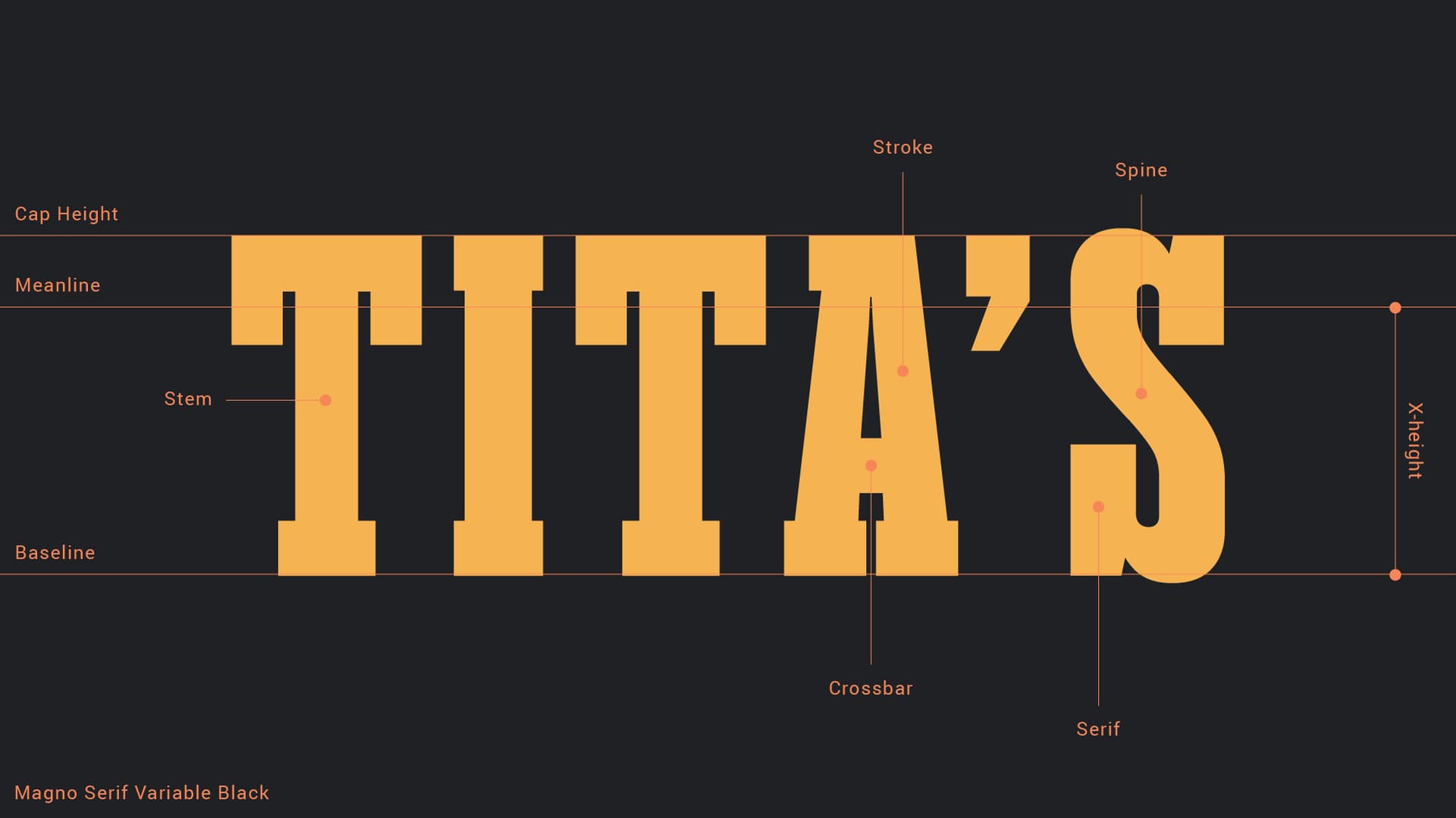
Anatomy diagram of Magno Serif Variable Black set as “TITA’S”, labelling stroke, spine, stem, crossbar and serif
Magno Serif Variable Black

4MAT TRYDENT

all work