

Pittsburgh Penguins Internship
Pittsburgh Penguins
2024
Overview
Graphic Design Intern for the Pittsburgh Penguins, fall of 2024. Arena boards, concourse posters, web banners, email, and print, all inside a brand system that was already built and already strict.
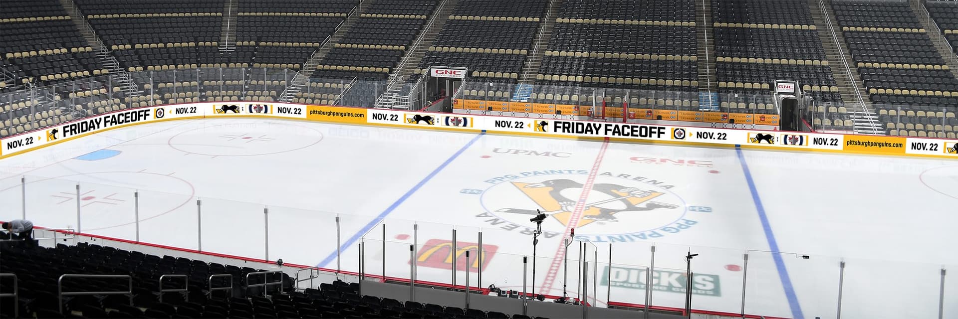
The gold band running around that rink is the widest thing I made. Flat, off the ice, it looks like this.

It is 4100 pixels by 180, which is not a shape you design a layout in. It is a shape you design a sentence in. There is no hierarchy to build and nowhere to put a second idea, so the whole job is deciding what the one line says and how few pieces it can say it in.
On the work itself I should be exact, because the honest answer changes piece by piece. A lot of it was working inside templates the team already had. Sometimes that meant populating one. Sometimes the content did not fit and the template had to give a little. By the end it was more often a size, a date, and a composition of my own, reviewed before it shipped.
The matrix boards
Shorter than the ribbon and taller, at 3072 by 463. Same problem, slightly more room: a promotion, a date, an opponent, and a reason to show up, read from a seat while a game is happening.


Everything else it had to become
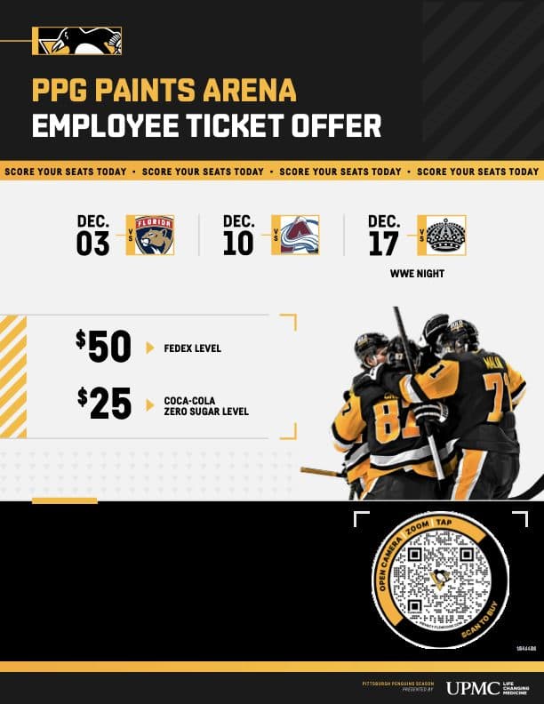
One promotion does not stay one shape. It becomes a poster in the concourse, a banner on the site, a card in the app, a full screen on the in-arena feed, and a flyer with a QR code on it. The system holds if the pieces still look related when nobody sees them side by side, which is the only place they are ever seen side by side.




Reflection
The thing I did not expect to keep is the ribbon board. It is the least glamorous file in the folder and the only one that made me throw out how I normally work. You cannot compose in it. You cannot build a hierarchy in a strip that is twenty two times wider than it is tall, and every instinct about balance is useless at that ratio. What is left is sequence: this, then this, then the thing you want them to remember, spaced far enough apart to survive being read in pieces as somebody turns their head.
I was an intern inside a system I did not build, and most of what I made was a variation on something that already existed. That is what the job was. What I took from it is that a constraint that severe is not a smaller version of a normal design problem. It is a different one.