

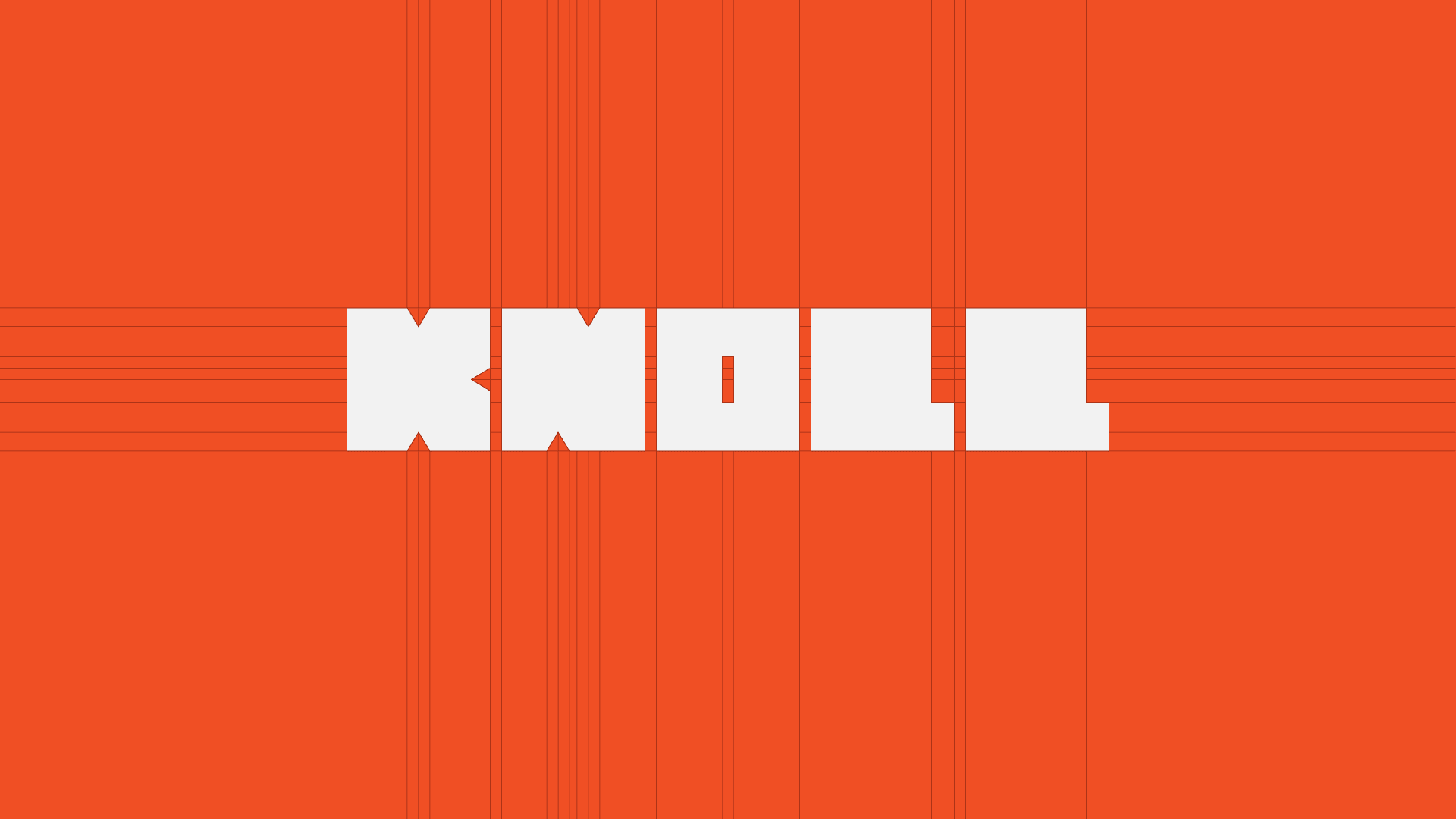
Knoll
Information and Publishing Design Systems
2024
Overview
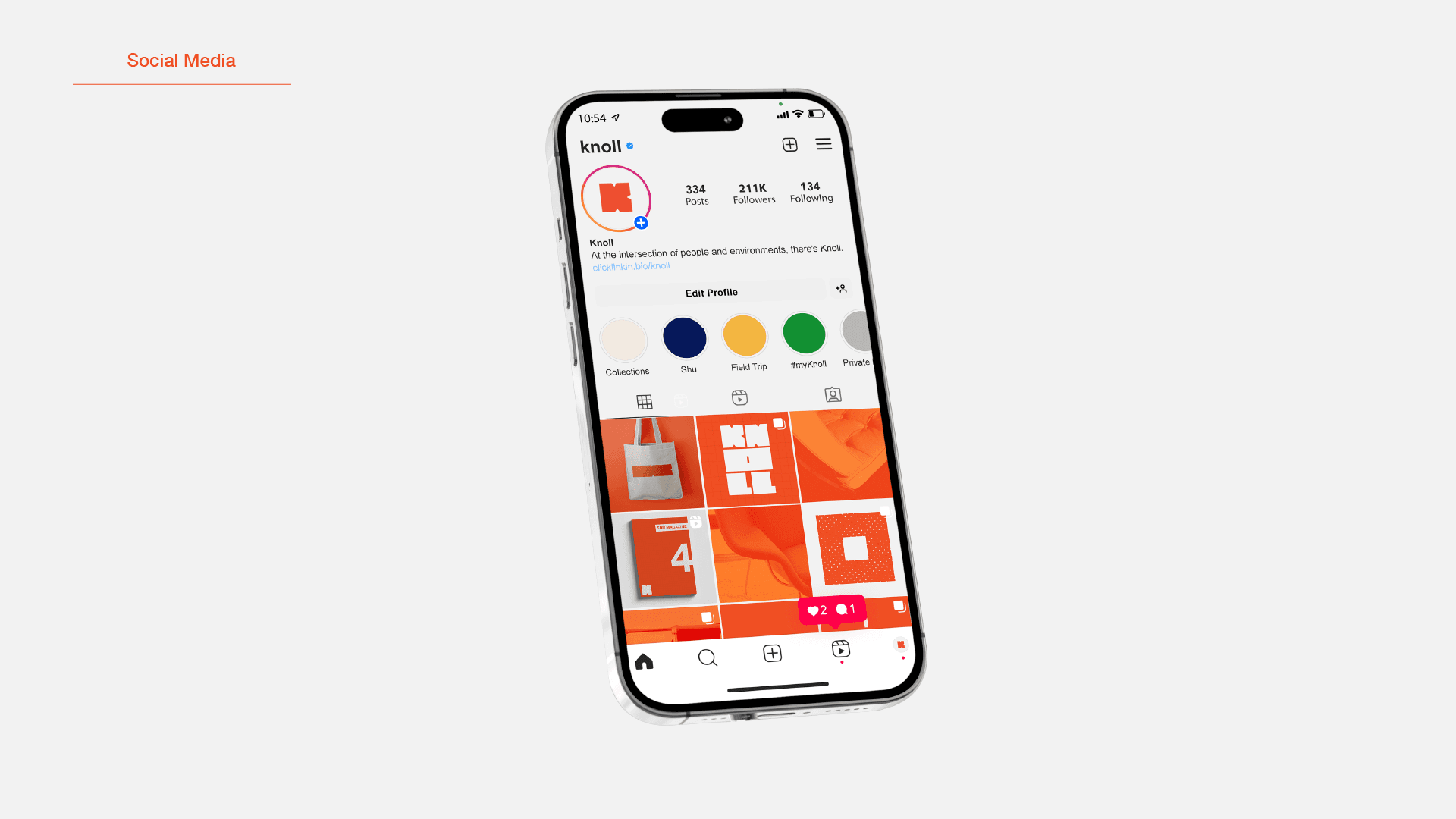
A concept redesign of the identity for Knoll, the American furniture company that has been building Bauhaus-descended modern furniture since 1938. The brief was a publishing design system, so the mark had to survive being put to work: a profile picture, an email header, a banner, a repeating pattern.
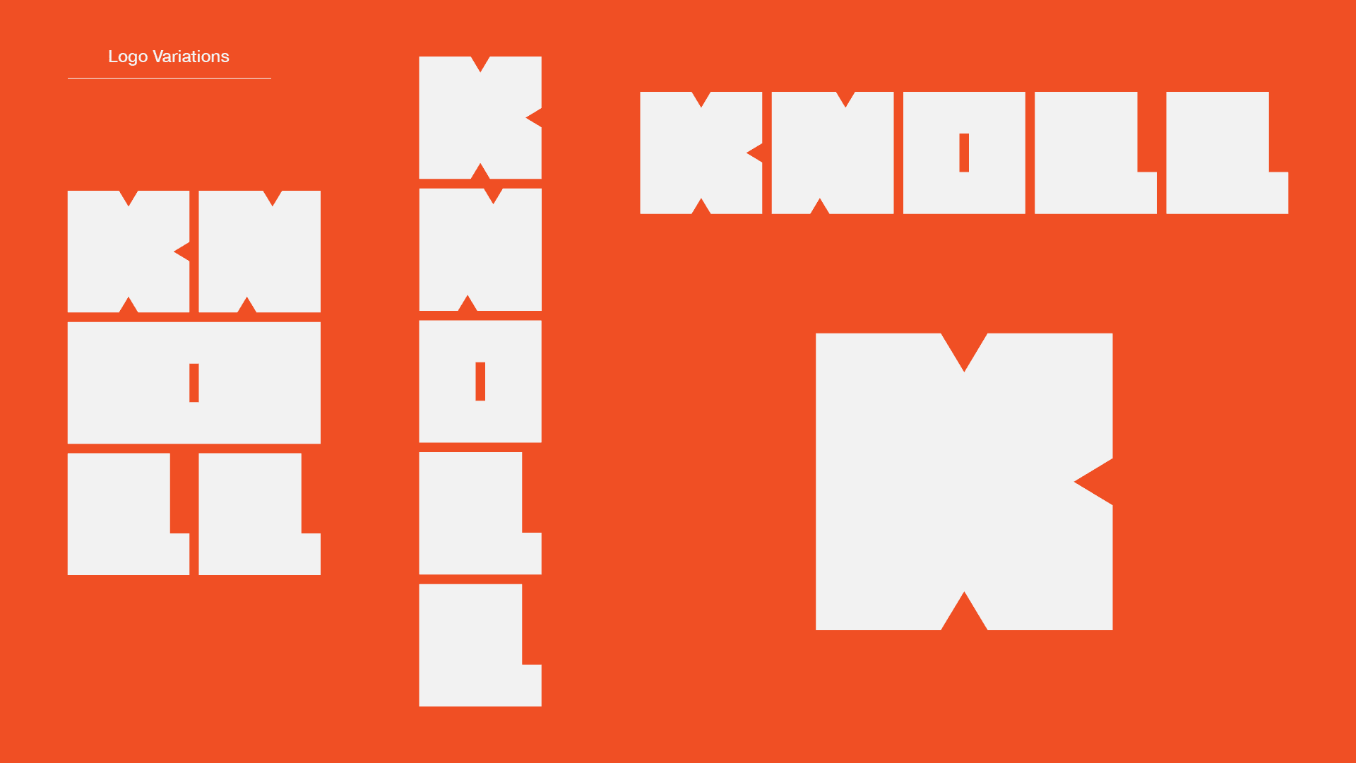
Knoll's own furniture is assembled from parts, so the logotype is too. Each letter is a block with triangular notches cut into its edges, and the notches are the joinery: they read as woodworking joints, which makes the letters look like they were carved from one shape and could snap back together. That is what lets the wordmark be rearranged into a row, a stack, or a single K without any of the arrangements looking like a compromise.
The mark is also stretchable, and it is stretchable for a specific reason: the notch keeps its real size at every width. It is 16% of the narrow mark and under 5% of the wide one, so the proportions of the block change completely while the joint stays exactly the joint. Nothing is being scaled, only extended.
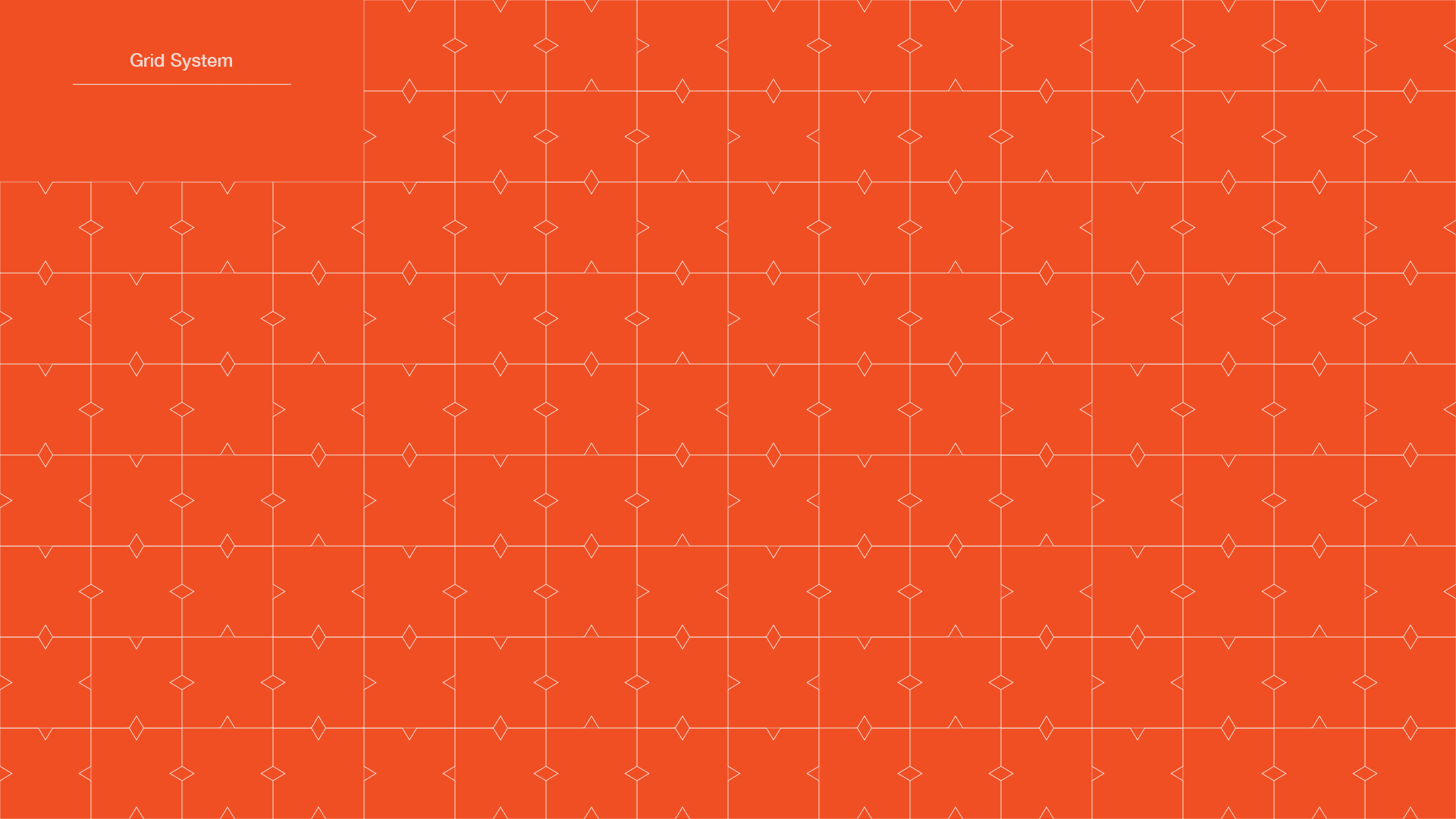
The notch turned out to be a pattern as well as a joint. Tiled edge to edge it makes the grid the rest of the system sits on, which is how a mark that only appears once on a page ends up setting the texture of every page.

Process Work
The starting point was a line Knoll uses about itself, that its goal is "both timelessness and adaptability, rejecting short-term trends." Adaptability is easy to claim in a brand deck and hard to draw, so I took it literally: a logotype that has more than one correct arrangement.
I sketched modular versions of the wordmark for a while before the notch appeared. The page below is where it lands. The letters are drawn as loose blocks, then annotated with what they can do rather than what they look like: letters can be ugly stacked, works vertically (more abstract, less readable), building blocks. One note in the margin reads cool motif for advertisement + motion, which is the first appearance of the thing running further up this page.
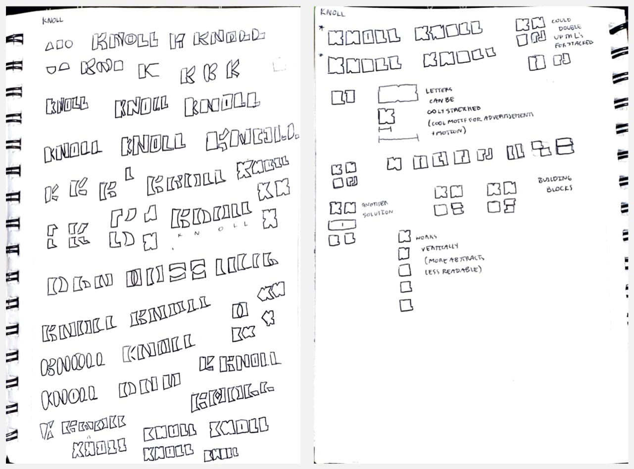
The second L was the thing critique caught, and it was a real defect rather than a taste note. Both L's are the same letter, so both should carry the same joint, but the extension I had drawn on the second one opened a gap that none of the other letters had. One reviewer put it as a gap "that becomes more noticeable than the rest"; another said to try the form without the extension so it stayed consistent. Cutting the extension fixed it, and it was the right call for the same reason the notch works at all: in a system built on one repeated joint, the letter that does its own thing is the one that reads as a mistake.